The Future
Creator: Klim Type Foundry
The Future in use
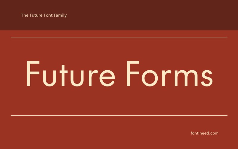
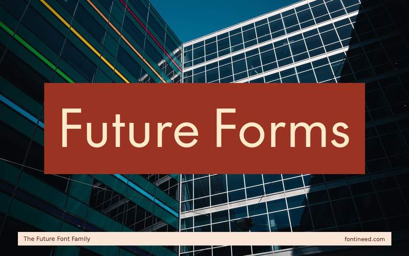
The Future can make a technical brand feel more deliberate through proportion. I’d put a mixed-case line such as “Future Forms” above a practical subheading and see whether the pairing still feels human when everything is reduced to a phone-sized header. The change of scale is a better test than a single large word.
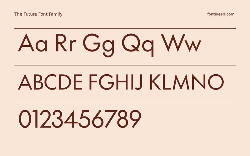
On a visual identity sheet, I’d put the small label test right next to the wordmark. If the font feels coherent through that change of scale, it can save a great deal of later adjustment. Build an ordinary page before building the launch graphic. Put a long button label and a short number into the same design. Once the type feels comfortable handling the everyday details, use the extra room in the display view to make the name sit confidently on the grid.

Download unavailable
This catalog entry is available for reference. A downloadable font file is not currently offered by this page.
Browse fonts with downloadsSimilar Fonts
Related catalog styles; compare the characters and license before choosing.
More by Klim Type Foundry
Explore other catalog entries credited to this designer.


Newly Added Fonts
Recently added to the FontIneed catalog.


