Industry
Creator: Fort Foundry
Industry in use
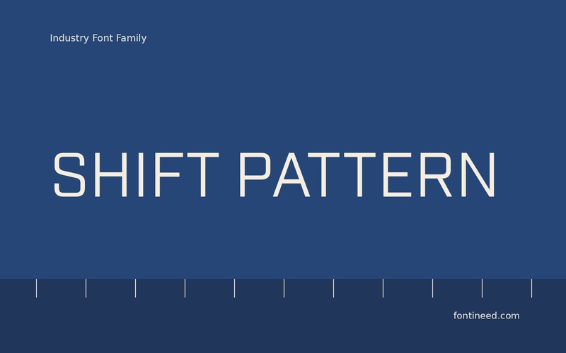
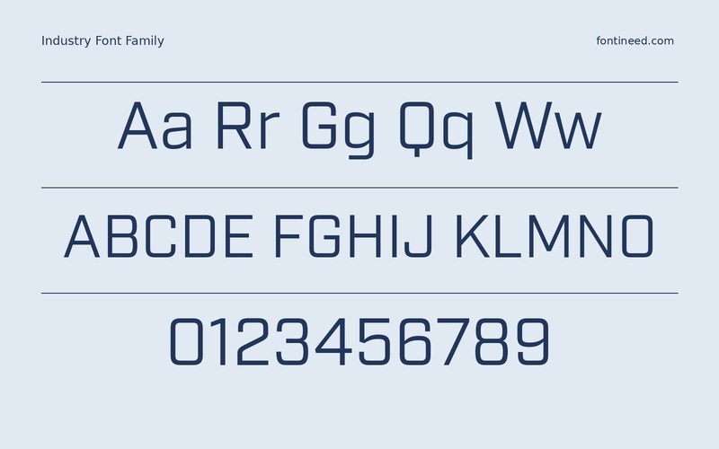
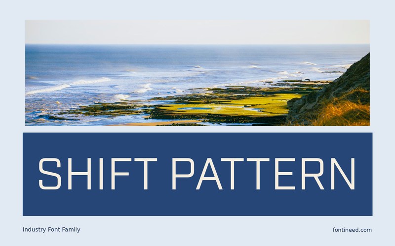
Industry gives short headings forward pressure through its condensed proportions. On a sign or racing graphic, “SHIFT PATTERN” puts that rhythm to work across a wide line without depending on decoration. I’d choose a sample with enough substance for the surrounding colors and check the word shape before setting the race details.
For a series of event cards, preserve the same margin around the main words. This helps the lean proportions feel deliberate when an individual title is unusually long or short. Make a proof with sponsor names and numerals in place. Open the layout on a small screen and view it from across the room. Keep the title anchors steady as the content around them changes. A strong condensed face is useful when the rest of the composition has plenty to say.

Download unavailable
This catalog entry is available for reference. A downloadable font file is not currently offered by this page.
Browse fonts with downloadsSimilar Fonts
Related catalog styles; compare the characters and license before choosing.
More by Fort Foundry
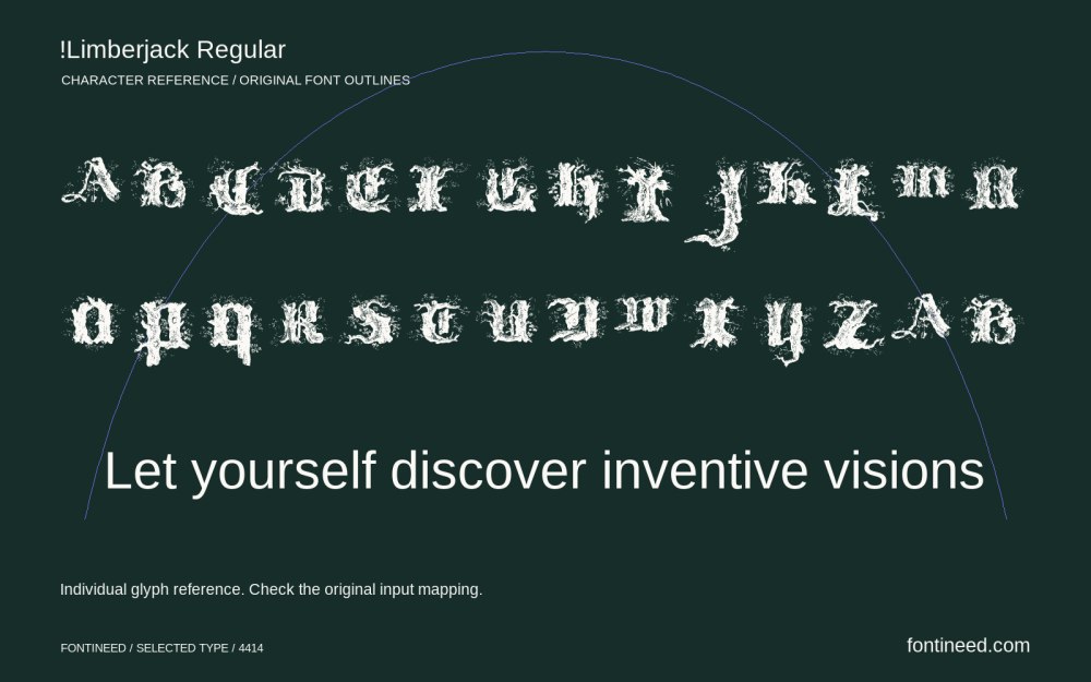
Explore other catalog entries credited to this designer.

Newly Added Fonts
Recently added to the FontIneed catalog.


