Bank Gothic
Creator: paratype
Bank Gothic in use
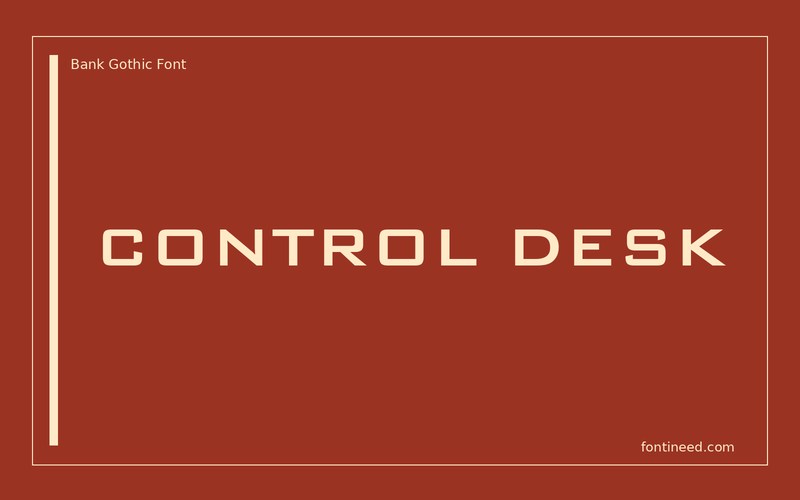
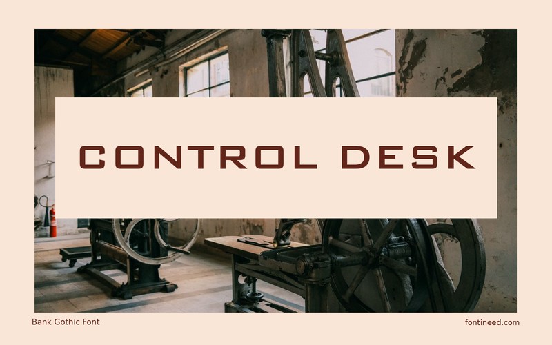
Bank Gothic is a good candidate for labels that are meant to suggest machinery or an industrial setting. “CONTROL DESK” shows how a line of capitals can sit like an engraved nameplate even when the layout remains completely flat. I’d place it in a short, well-defined panel.
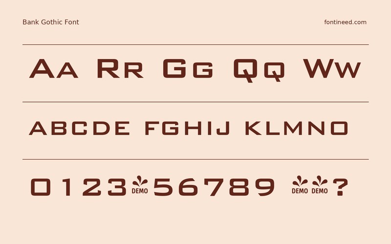
Compare the main title with a plain row of captions and numbers. The contrast between them makes it easier to tell which information belongs to the visual identity. Use an ordinary reading face for longer instructions. The squared forms can give repeated short labels a clear identity without dominating everything around them.
It also has a plausible role on a short film title where technical precision is part of the mood. I’d keep the rest of the credits in a faster-reading face.

Download unavailable
This catalog entry is available for reference. A downloadable font file is not currently offered by this page.
Browse fonts with downloadsSimilar Fonts
Related catalog styles; compare the characters and license before choosing.
Newly Added Fonts
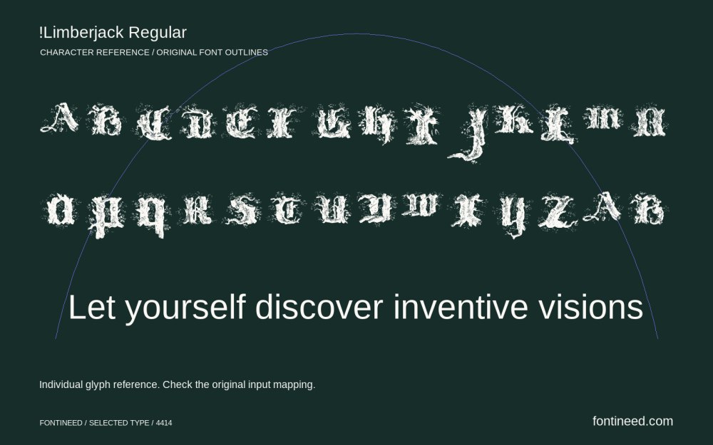
Recently added to the FontIneed catalog.


