Slaab
Creator: That That Creative
Slaab in use
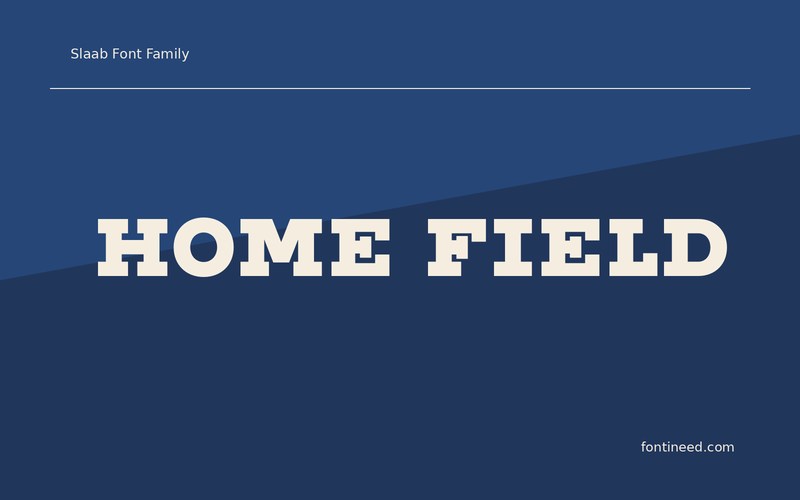
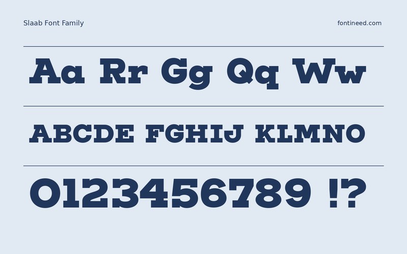
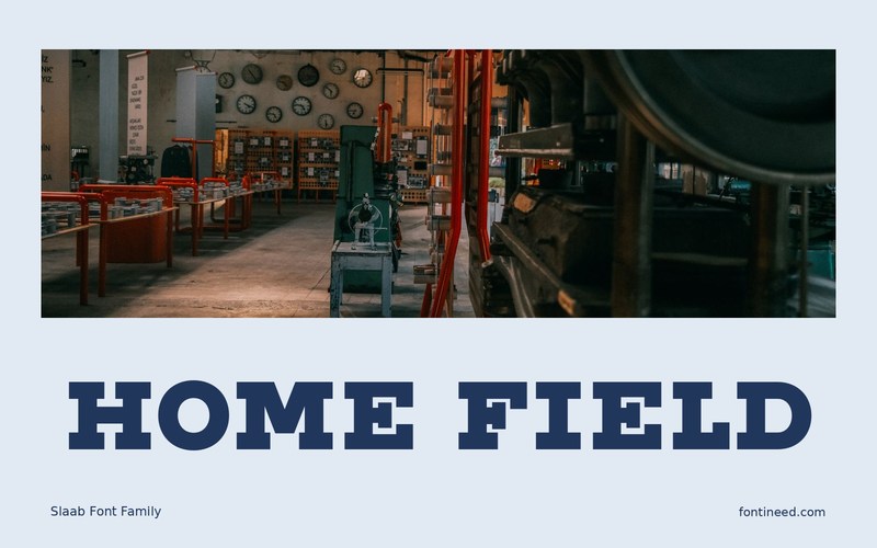
Slaab gives a collegiate heading a steady rhythm by putting real weight into the serifs. “HOME FIELD” is a useful first proof. The two words have different widths, and the broad feet give both a footing on the page. I’d try it on a match poster that needs to feel rooted in the club even when the school colors and crest have yet to go in.
Start the design with the actual fixture name, especially if it has to fit a narrow program cover. Compare the outline of the title with a separate line of scores or times. The pairing works when you can identify the team from across the room and still find the fixture information on a phone.
A small monochrome print is worth making before working on texture. It shows where the serifs need room and which line can afford to sit closer to the edge.

Download unavailable
This catalog entry is available for reference. A downloadable font file is not currently offered by this page.
Browse fonts with downloadsSimilar Fonts
Related catalog styles; compare the characters and license before choosing.


Newly Added Fonts
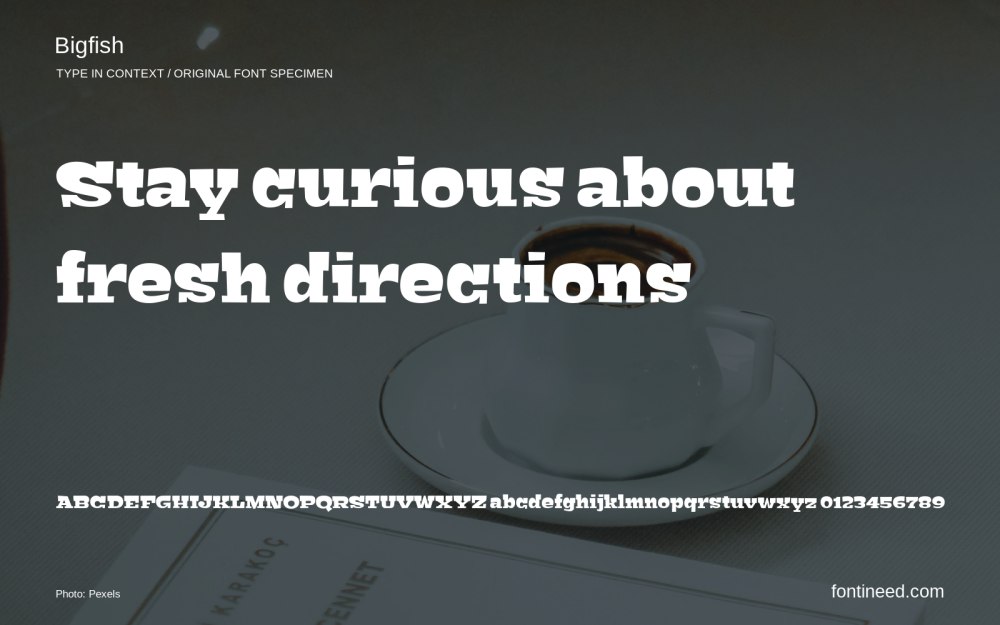
Recently added to the FontIneed catalog.


