Manuka
Creator: Klim Type Foundry
Manuka in use
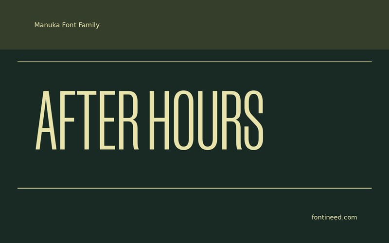
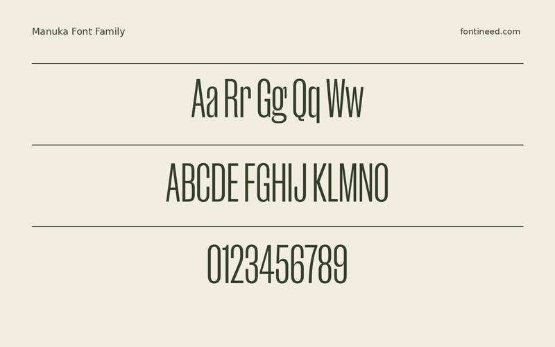
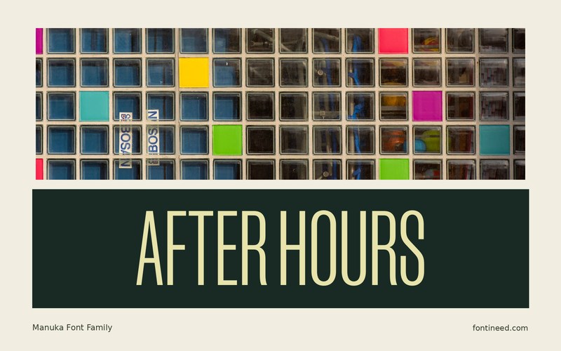
Manuka does something useful with a tall, narrow space. It lets a title feel large without demanding a very wide column. On a sleeve, I’d try the words “AFTER HOURS” beside the edge of a photograph and see whether opening the line spacing gives the image room to speak.
The important decisions here are width and rhythm. Compare the headline on a tall poster and in a square tile. If it starts to feel squeezed on the square, try a stronger break and let the condensed lettering retain its proportions. A smaller line in another width can complete the structure.
It is also effective beside a wide unlettered image. There the compressed shape can make a strong counterpoint to a photograph that needs the full width of the design.

Download Manuka
ZIP archive
Similar Fonts
Related catalog styles; compare the characters and license before choosing.
More by Klim Type Foundry
Explore other catalog entries credited to this designer.


Newly Added Fonts
Recently added to the FontIneed catalog.


