Söhne
Creator: Klim Type Foundry
Söhne in use
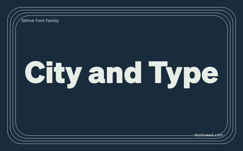
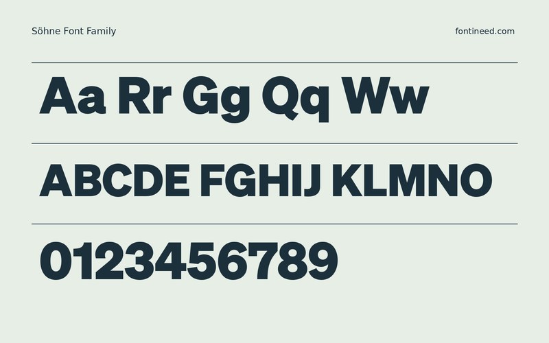
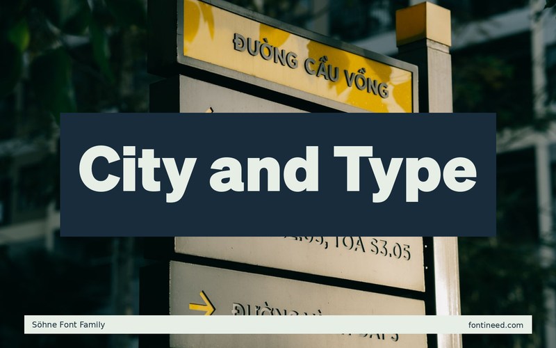
The Söhne sample has the calm proportions I want from a navigation system, with enough variation among widths to make words readable as words. I’d test it on a cultural site where “City and Type,” an article date, and a navigation label need to feel related while carrying different weight.
Work at actual interface sizes early. Let the article title sit on two lines and compare the reading rhythm with a compact menu using the same family. When the menu begins to resemble a row of headlines, pull the emphasis back there. The type earns its place by making these levels easy to tell apart.
For a print extension, try a table of contents with a different section size on the same grid. The medium weights are worth testing where an emphatic line feels too loud.

Download Söhne
ZIP archive
Similar Fonts
Related catalog styles; compare the characters and license before choosing.
More by Klim Type Foundry
Explore other catalog entries credited to this designer.


Newly Added Fonts
Recently added to the FontIneed catalog.


