Recoleta
Creator: Latinotype
Recoleta in use
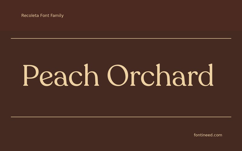
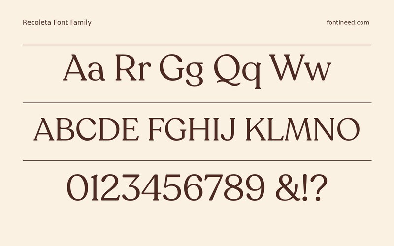
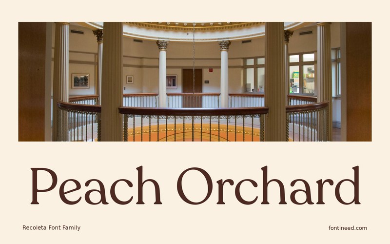
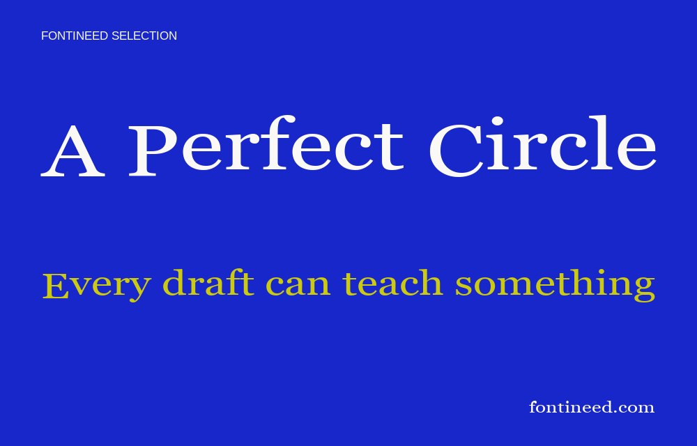
Recoleta has rounded weight that can make a word feel welcoming in a compact composition. I’d try “Peach Orchard” on a label with a plain ground and very little decoration. The softer serif profile can give the product a familiar voice while the name still carries enough edge to read clearly.
Use a short, readable variant on the neck of a bottle or the side of a box. It can relate the outer surfaces without claiming the same attention as the front label. Look at the label on an actual container as well as flat on the screen. Leave generous room where the text falls near a curve or seam. Keep weights and ingredients underneath in a simple line. The expressive heading can round out the package without making the small details share its tone.

Download unavailable
This catalog entry is available for reference. A downloadable font file is not currently offered by this page.
Browse fonts with downloadsSimilar Fonts
Related catalog styles; compare the characters and license before choosing.


More by Latinotype
Explore other catalog entries credited to this designer.

Newly Added Fonts
Recently added to the FontIneed catalog.


