Juana
Creator: Latinotype
Juana in use
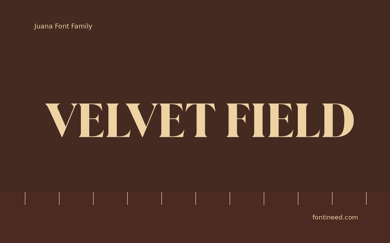
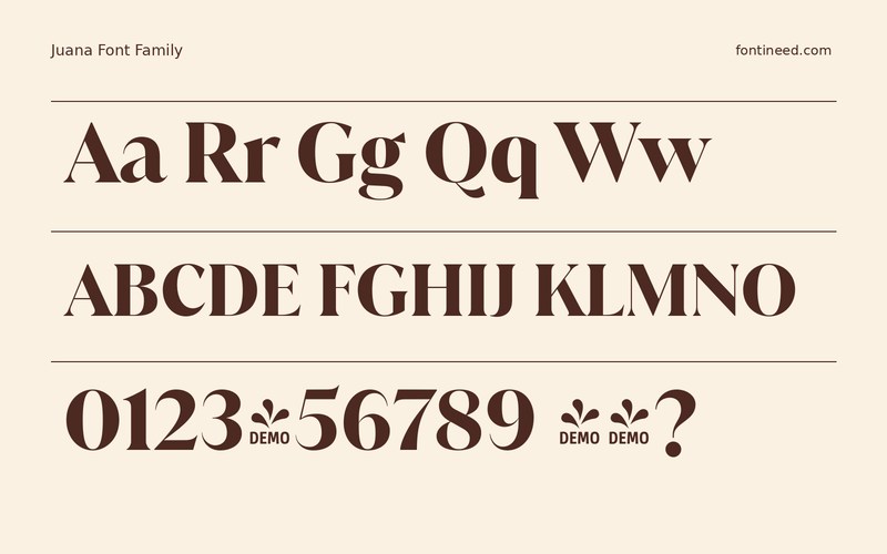
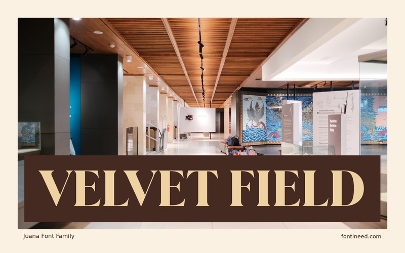
Juana is most convincing to me when a headline is allowed to occupy enough space that you can see its shifts in weight. “VELVET FIELD” makes a good start for an editorial title. The drawing puts broad strokes and finer details into the same line, giving the words some tension against a quiet page.
Check the edge of each word where the title approaches a photograph or border. Then test a simple supporting line in a different weight. I would keep the largest title as the main place where the finer details are on show. That makes the hierarchy readable even in a compact web crop. On a contents page, a single title in this treatment can make an effective shift in pace. The reader should still recognize the chapter divisions immediately through the simpler type beneath.

Download unavailable
This catalog entry is available for reference. A downloadable font file is not currently offered by this page.
Browse fonts with downloadsSimilar Fonts
Related catalog styles; compare the characters and license before choosing.




More by Latinotype
Explore other catalog entries credited to this designer.

Newly Added Fonts
Recently added to the FontIneed catalog.


