Neue Montreal
Creator: Pangram Pangram
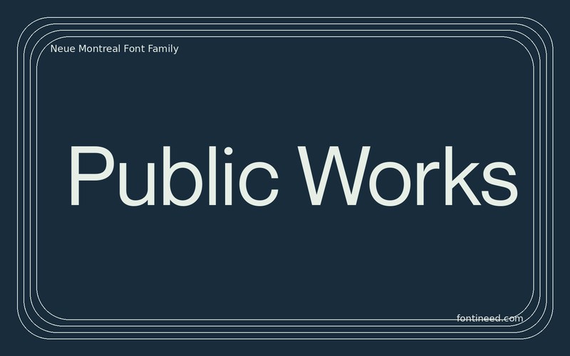
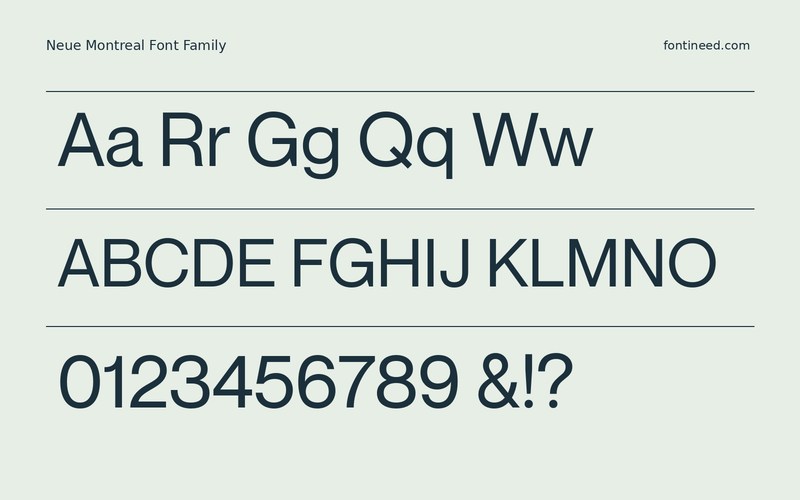
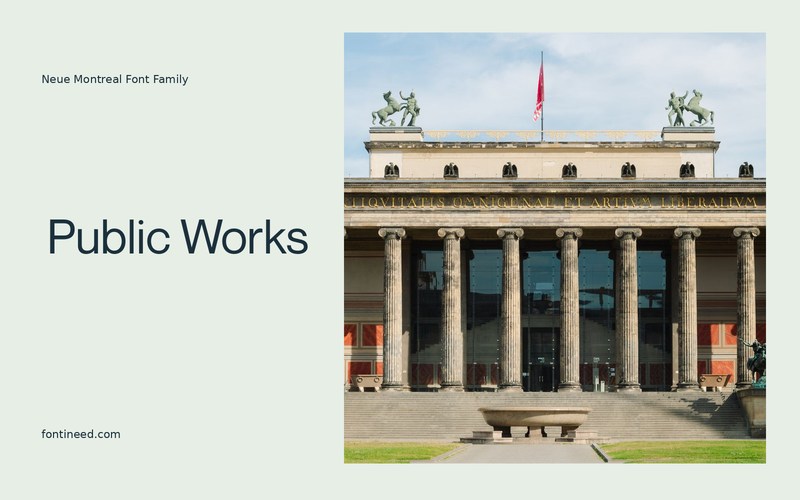
Neue Montreal in use
Neue Montreal is a good candidate for a restrained typographic identity. In “Public Works,” the shapes have enough structure to hold a sign or section title. At small sizes, that same structure can organize the practical information underneath. I’d test the cut against both a short name and a heading that almost fills its column. A lot of the appeal is visible once a project contains a real list of awkward labels. Keep the line spacing generous enough that the plain forms can do their job there too.
Use the real address or menu labels in the proof. Once there is a clear gap between the primary line and the secondary writing, reduce the size of the whole composition and see if the hierarchy survives. It should remain clear even when the title is the only element with room to breathe.

Download unavailable
This catalog entry is available for reference. A downloadable font file is not currently offered by this page.
Browse fonts with downloadsSimilar Fonts
Related catalog styles; compare the characters and license before choosing.
More by Pangram Pangram
Explore other catalog entries credited to this designer.


Newly Added Fonts
Recently added to the FontIneed catalog.


