Hatton
Creator: Pangram Pangram
Hatton in use
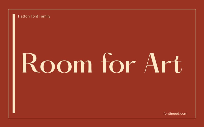
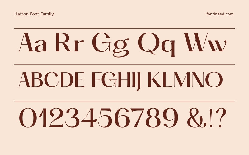
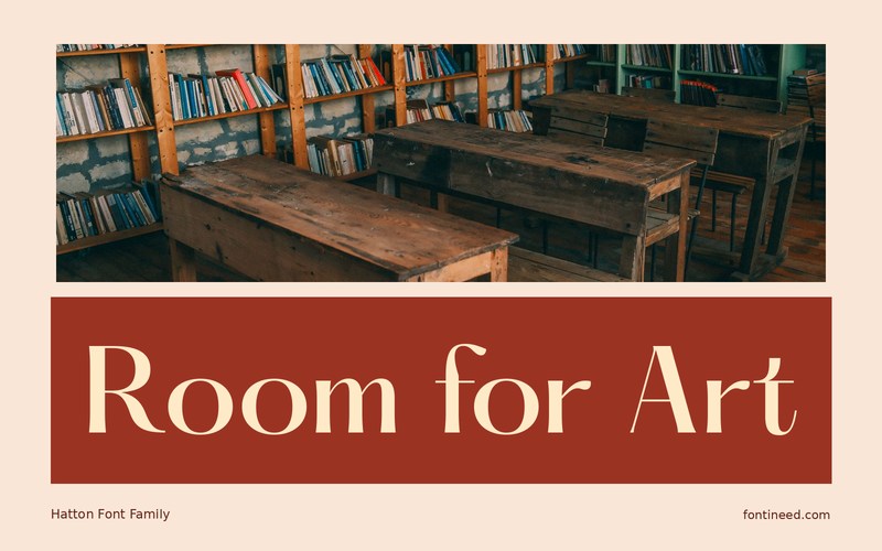
Hatton can make an editorial headline feel drawn rather than simply typeset. In “Room for Art,” the change from broad capitals to smaller letters makes the line visually interesting at generous scale. An exhibition booklet is where I would try it first, with room to see the transitions in the forms. Watch the fold on a full-bleed spread. A decorative capital near the gutter can demand more space than a flat proof suggests, especially when the next page begins with a dense image.
Set the headline in the context of two captions and a page number. The hierarchy should still hold on an image-rich spread. I’d make the headline large enough to retain its detail and use some quiet margin around it. A small crop can be enough to change how the whole page balances.

Download Hatton
ZIP archive
Similar Fonts
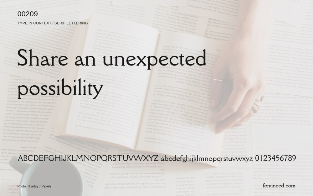
Related catalog styles; compare the characters and license before choosing.


More by Pangram Pangram
Explore other catalog entries credited to this designer.


Newly Added Fonts
Recently added to the FontIneed catalog.


