Wild Youth
Creator: Jeremy Vessey
Wild Youth in use
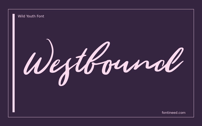
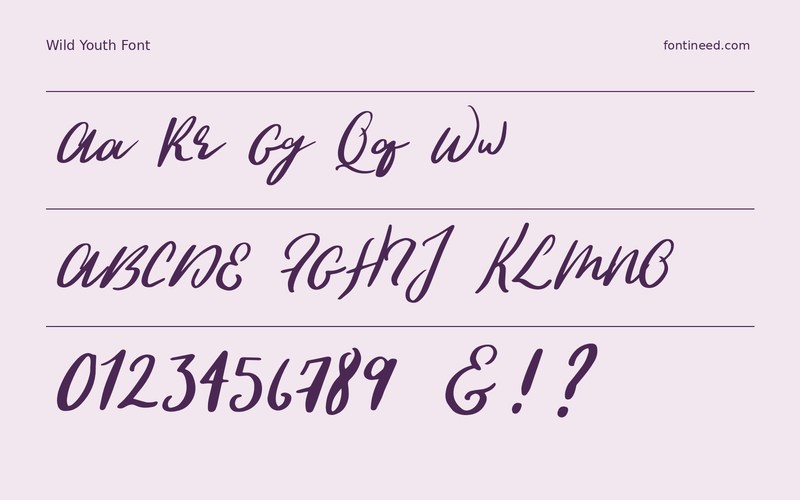
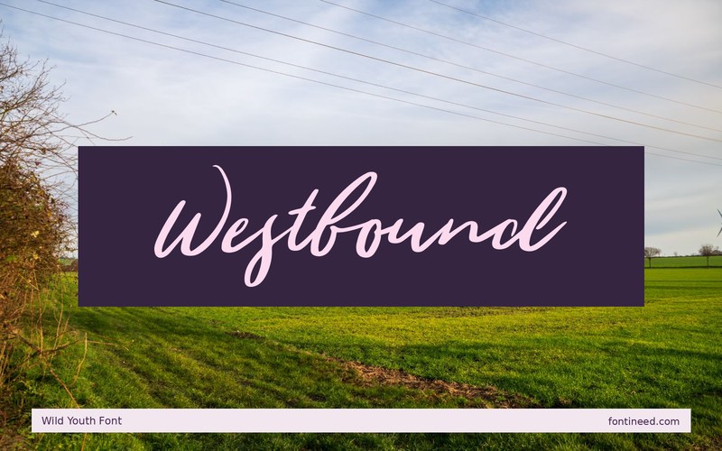
Wild Youth suits a project where the headline can feel painted in one direction. I like “Westbound” as a test because it has just enough letters to show the shift between the broad initial gesture and the quieter middle. Set it on a photo cover with a clean horizon rather than a busy detail.
I’d start with one ink color and give the lettering a predictable area in the frame. If the brush disappears in the travel image, compare high-contrast versions before enlarging it. The whole phrase should feel spontaneous and stay clear on first reading. Use an unobtrusive caption for location and date so the credit can be read at a different tempo. This works particularly well when the photograph itself provides only quiet directional cues.

Download unavailable
This catalog entry is available for reference. A downloadable font file is not currently offered by this page.
Browse fonts with downloadsSimilar Fonts
Related catalog styles; compare the characters and license before choosing.
Newly Added Fonts
Recently added to the FontIneed catalog.


