Suisse
Creator: Swiss Typefaces
Suisse in use
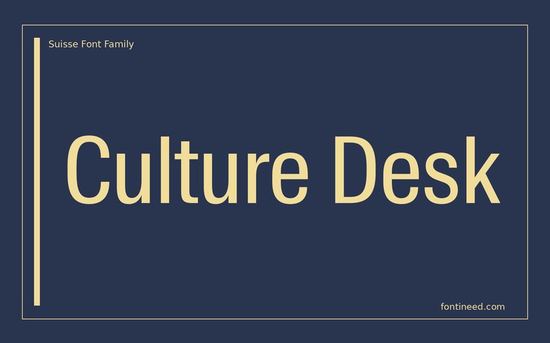
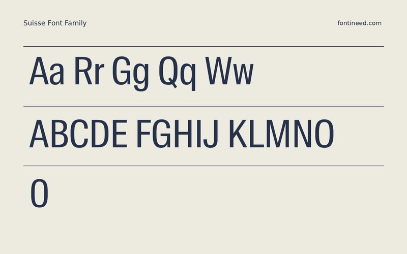
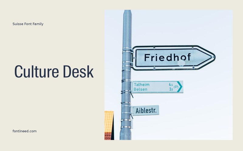
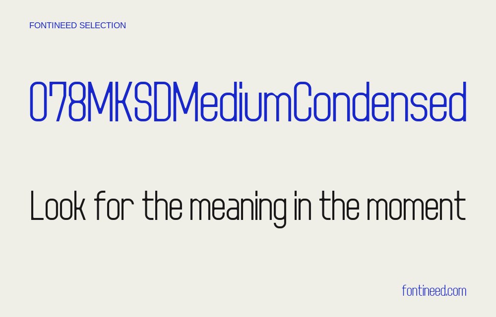
Suisse contains enough variation to make layout decisions more interesting than just choosing a weight. The condensed sample is useful for a narrow editorial column where a heading and a regular caption need to share a system. I’d test “Culture Desk” next to a deliberately long department name.
Compare what happens when the dense headline moves to a phone. A single line may feel controlled at print size and rushed in a narrow column. I would keep the supporting text at a comfortable width, then let the narrower cut come back for labels where space is genuinely scarce.
A section index provides a useful second trial. Bring the narrower cut back for numerous headers and compare whether increasing line spacing improves the inventory of names.

Download Suisse
ZIP archive
Similar Fonts
Related catalog styles; compare the characters and license before choosing.
Newly Added Fonts
Recently added to the FontIneed catalog.


