Sabersong
Creator: Madhaline Studio
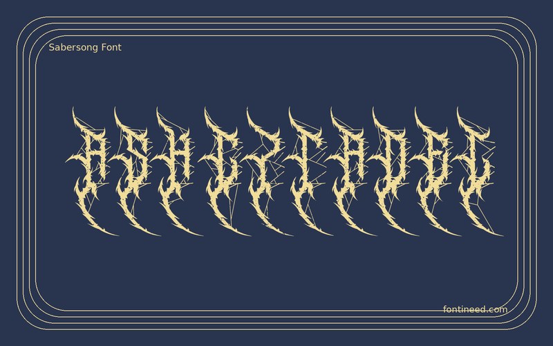
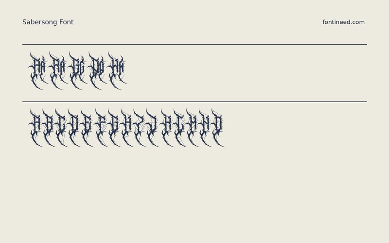
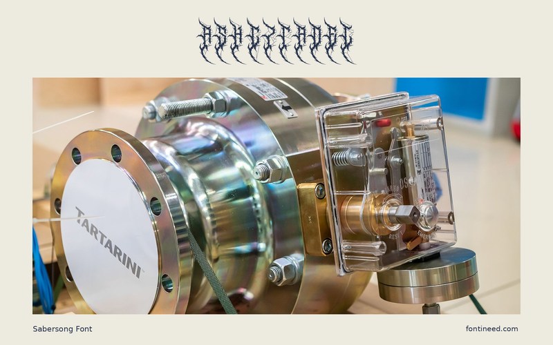
Sabersong in use
Sabersong builds a dense vertical rhythm from pointed strokes. I’d use that density to give a one- or two-word name the weight of an emblem. It works particularly well on a record sleeve where a blackletter band name and a plain track listing serve very different reading speeds.
Start by looking at the word as a silhouette. View the cover at streaming-thumbnail size and then at full size. The initial and final letters should still read through the dark strokes. I’d set two line breaks before making any tracking adjustments, because the overall shape matters more here than matching a predetermined width. One material I’d test is a matte black sleeve with a light ink. The pointed ends become part of the surface where the printing can hold the smaller details.

Download Sabersong
ZIP archive
Similar Fonts
Related catalog styles; compare the characters and license before choosing.
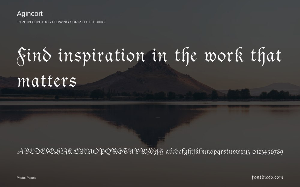
Newly Added Fonts
Recently added to the FontIneed catalog.


