Roobert
Creator: Martin Vácha
Roobert in use
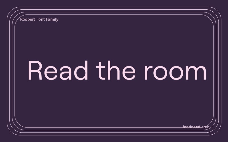
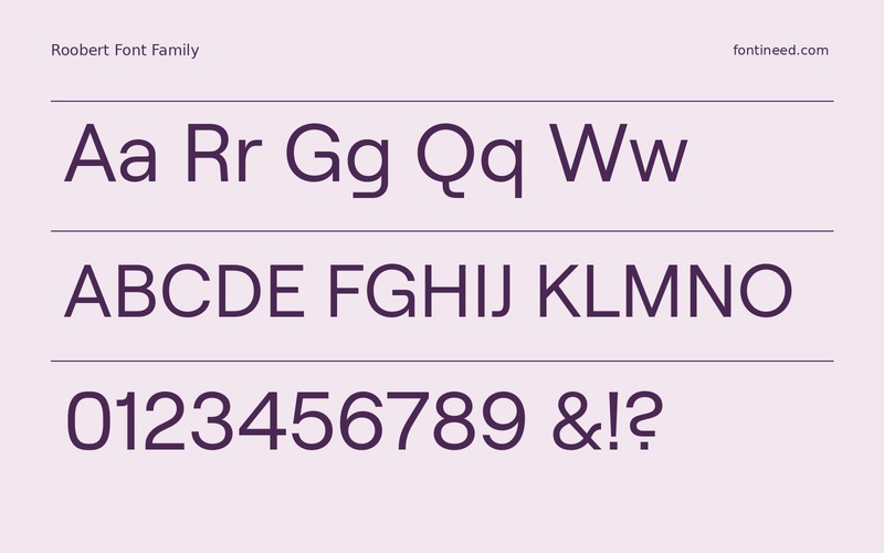
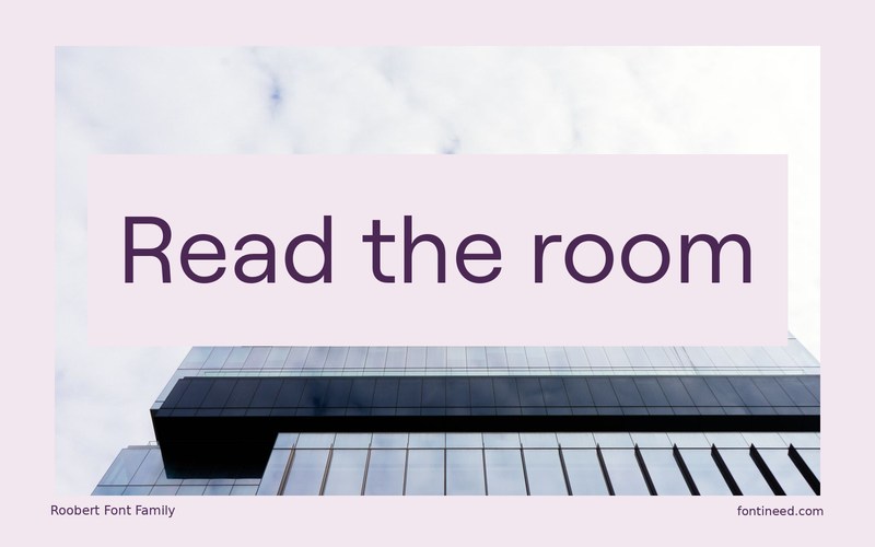
Roobert is the kind of sans I would audition with real interface writing on the screen. Round shapes and a measured rhythm make it a useful candidate for a product where approachable language shares space with tight tables and thumbnails. “Read the room” sounds simple and gives the round forms something to do. Once the page works, test text at increased browser zoom. The same type choices should make sense when labels stretch and a short list becomes a longer column.
Make the trial include a long navigation item, a bold notice, and an actual line of instructions. Decide where the bolder text should appear by looking at how the whole panel reads in one glance. A well-placed bold label can make the screen calmer than putting every label on the same level.

Download Roobert
ZIP archive
Similar Fonts
Related catalog styles; compare the characters and license before choosing.
Newly Added Fonts
Recently added to the FontIneed catalog.


