Mazzard
Creator: guxjohn
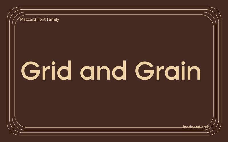
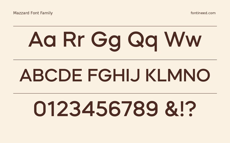
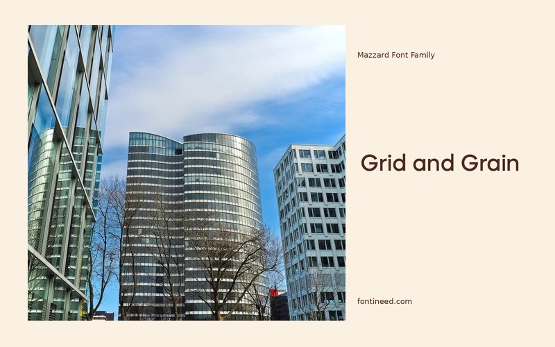
Mazzard in use
Mazzard contains groups with differing lowercase proportions, so I’d choose the group with the finished layout in front of me. The H sample gives lowercase words a visible presence in “Grid and Grain,” a useful starting point for headings that sit close to a supporting line.
Treat spacing between groups as part of the design, especially if the font will appear in a presentation. A panel may feel more legible after a margin adjustment even when the type size stays fixed. Proof an agenda slide and a page title together. Pay attention to how the shortest labels hold their own next to longer phrases, then pick the weight that survives both conditions. I’d use the alternate proportions to solve a particular hierarchy problem. Let that job define the choice of cut across the rest of the project.

Download Mazzard
ZIP archive
Similar Fonts
Related catalog styles; compare the characters and license before choosing.
Newly Added Fonts
Recently added to the FontIneed catalog.


