Master of Break
Creator: StereoType
Master of Break in use
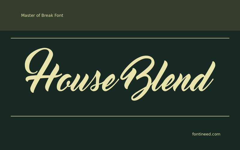
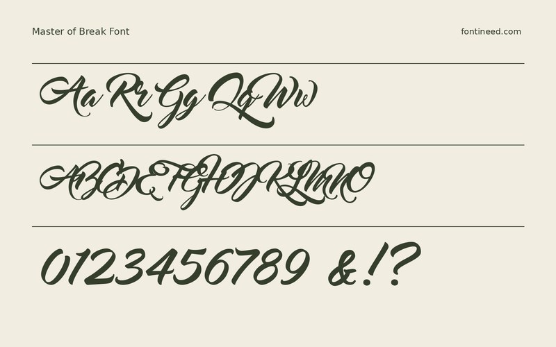
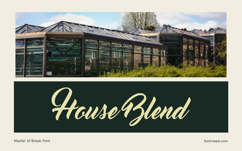
A coffee menu is a useful test for Master of Break because names such as “House Blend” give it room to turn, while the practical information around them keeps the counter rhythm clear. The script brings the appearance of lettering written for that particular menu rather than a uniform set of titles.
Use a separate straight line to name the origin or roast. Making that a reliable position across a whole menu will make each brush-lettered name feel intentional. I’d give the first and last strokes permission to extend beyond the text column, then align the underlying menu information with an upright font. If the script starts crowding the price, put the price below the name. Short fixtures like this let one expressive line do the work of a much busier layout.

Download Master of Break
ZIP archive
Similar Fonts
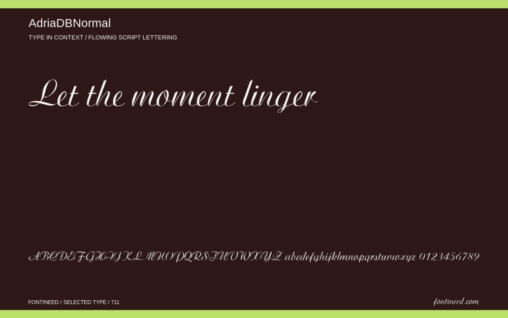
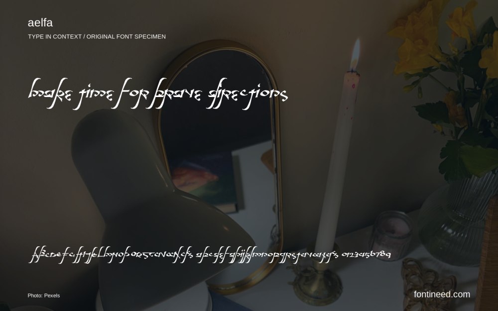
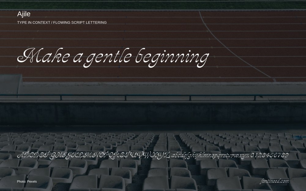
Related catalog styles; compare the characters and license before choosing.
More by StereoType
Explore other catalog entries credited to this designer.

Newly Added Fonts
Recently added to the FontIneed catalog.


