Lordish Blackletter
Creator: creativemedialab
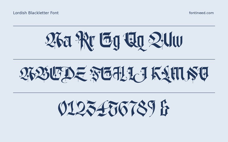
Lordish Blackletter in use
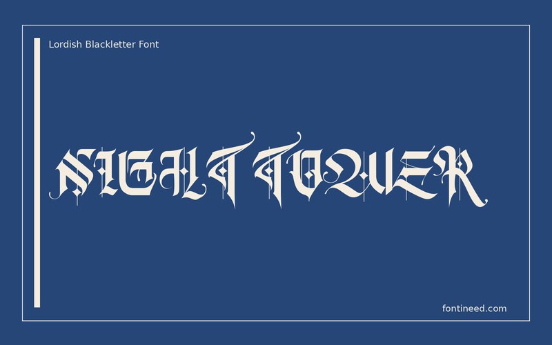
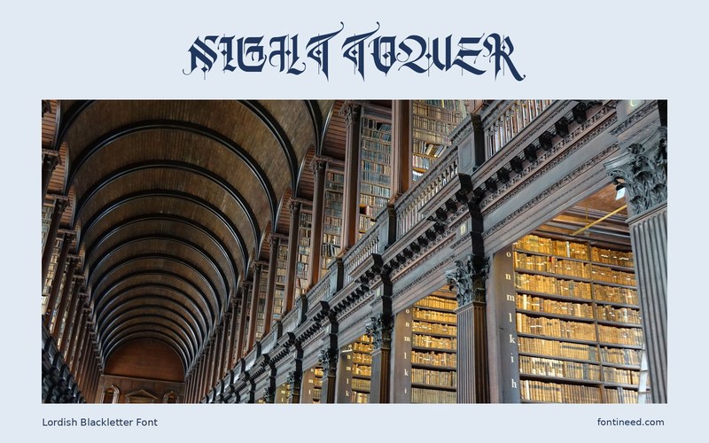
Lordish has a blackletter rhythm where the dark uprights do a great deal of the visual work. A title like “NIGHT TOWER” can feel like a drawn crest before a single illustration is added. I’d look at it for a club poster or a short name on a sleeve.
Start at the smallest proof size and read the title to somebody who already sees the graphic. Any point where the name needs explanation deserves more space. A clean line for supporting information can give the sharp lettering a clear area of its own and keep the viewer from having to read every word in the same voice. If the word will be embroidered or printed, compare the gaps between narrow strokes in an actual print trial. A broad outline that looks fine on a monitor can behave differently on coarse material.

Download Lordish Blackletter
ZIP archive
Similar Fonts
Related catalog styles; compare the characters and license before choosing.
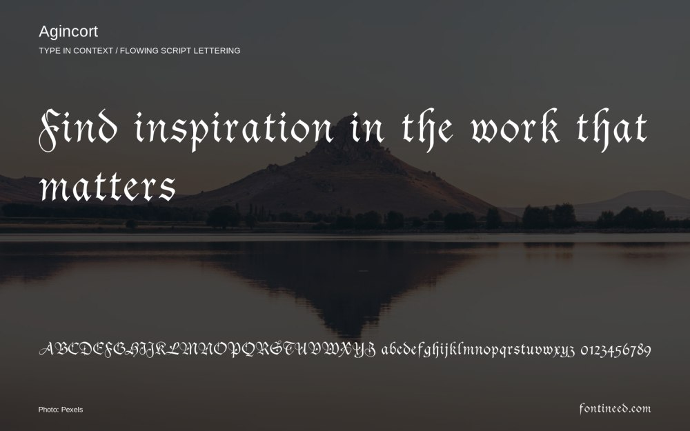
Newly Added Fonts
Recently added to the FontIneed catalog.


