Holland Script
Creator: Lettersiro Co.
Holland Script in use
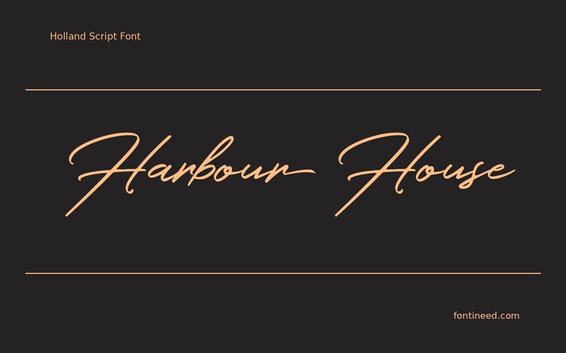
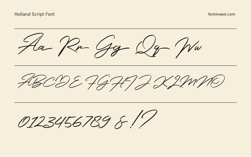
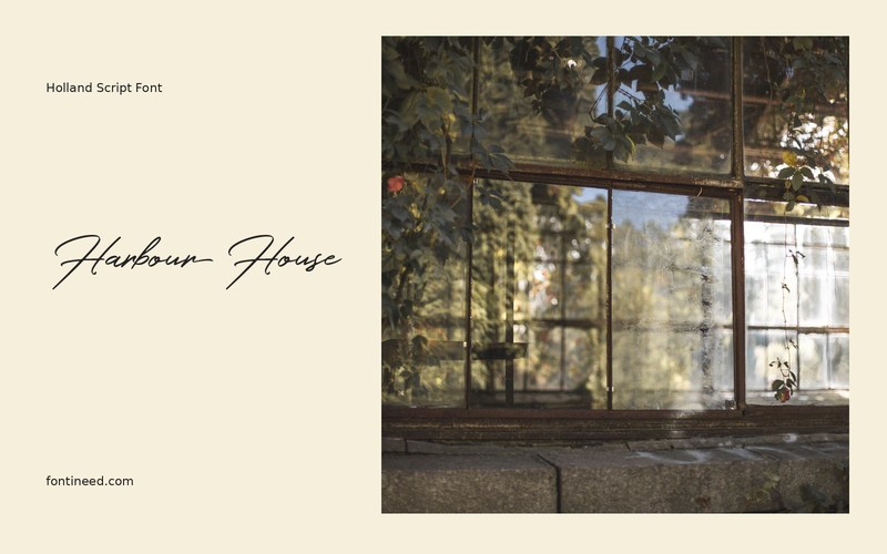
Holland Script moves through a name as if it were written in one sitting. Its upright-to-slanted changes are especially noticeable across the double letters in “Harbour House.” At invitation size, that rhythm makes the name feel personal before the reader has seen the wording beneath it.
My preferred layout is a large name above a compact, upright line for the date. I’d set both on a proof at the finished card size. On a narrow card, stacking the venue over the town gives the script room at the edges and lets the practical information keep a straight left margin.
Try ivory paper printed in navy for the first proof. Since the words already have a sense of motion, a straight, understated layout makes a useful counterweight.

Download Holland Script
ZIP archive
Similar Fonts
Related catalog styles; compare the characters and license before choosing.
Newly Added Fonts
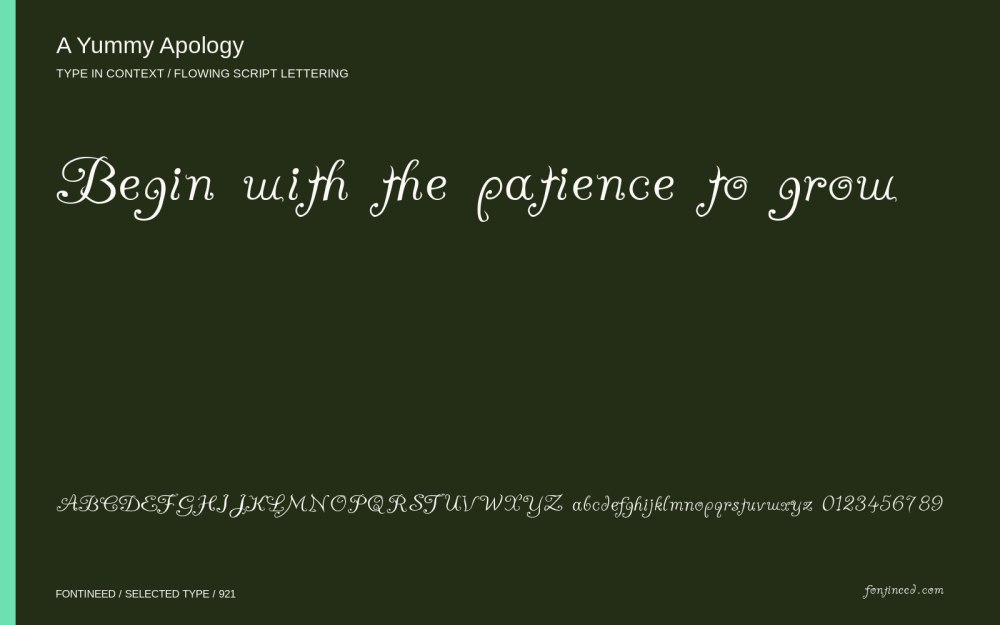
Recently added to the FontIneed catalog.


