Helvetica Now
Creator: Monotype
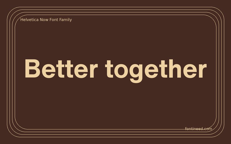
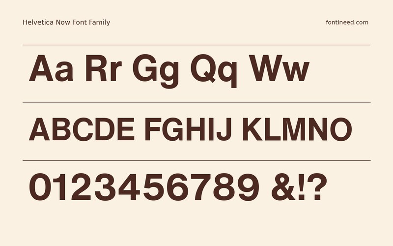
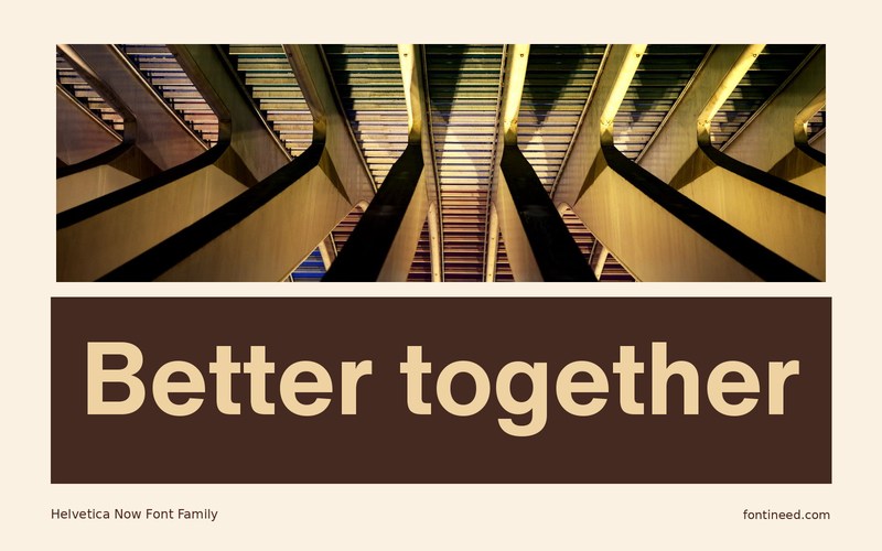
Helvetica Now in use
Helvetica Now Text is the cut I would put into a real small-scale layout before looking at a type specimen. Check a button, a two-line title, and a paragraph of instructions. This is where the spacing between letters and the contrast between related labels matter most.
I’d run the same proof at a mobile width and in a broad desktop panel. Watch which elements remain easy to parse when the surrounding room changes. The design can then use fewer visual effects because the type itself organizes the information. Start with the most ordinary page and see how far that clarity can carry. Include a long number and punctuation in the mobile proof. Neutral typography is most valuable when those details feel as orderly as the showpiece title does.

Download Helvetica Now
ZIP archive
Similar Fonts
Related catalog styles; compare the characters and license before choosing.
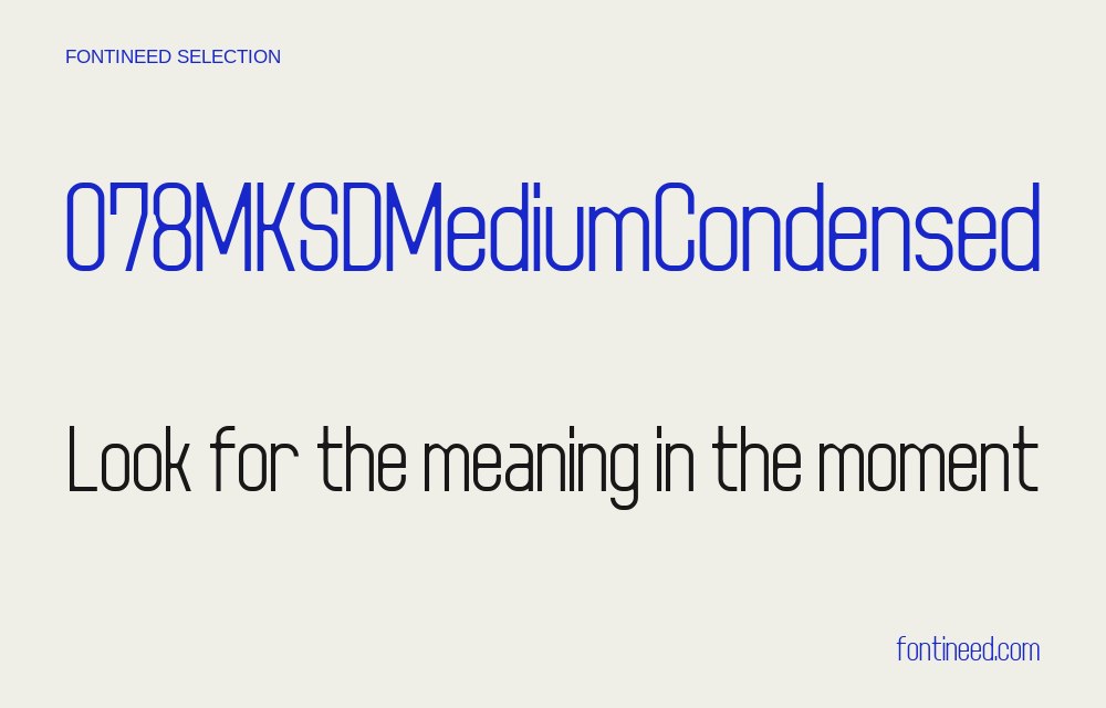
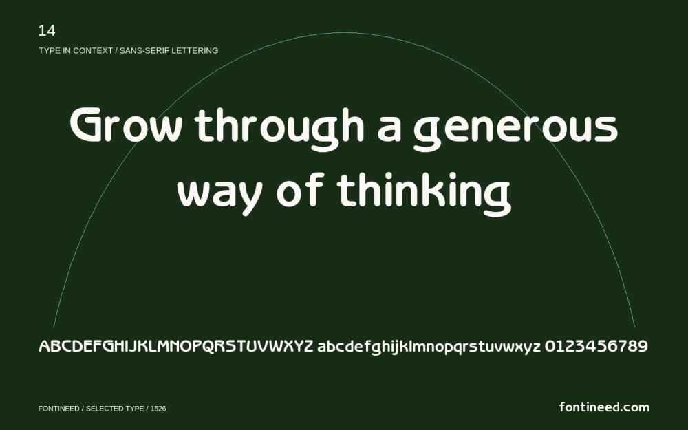
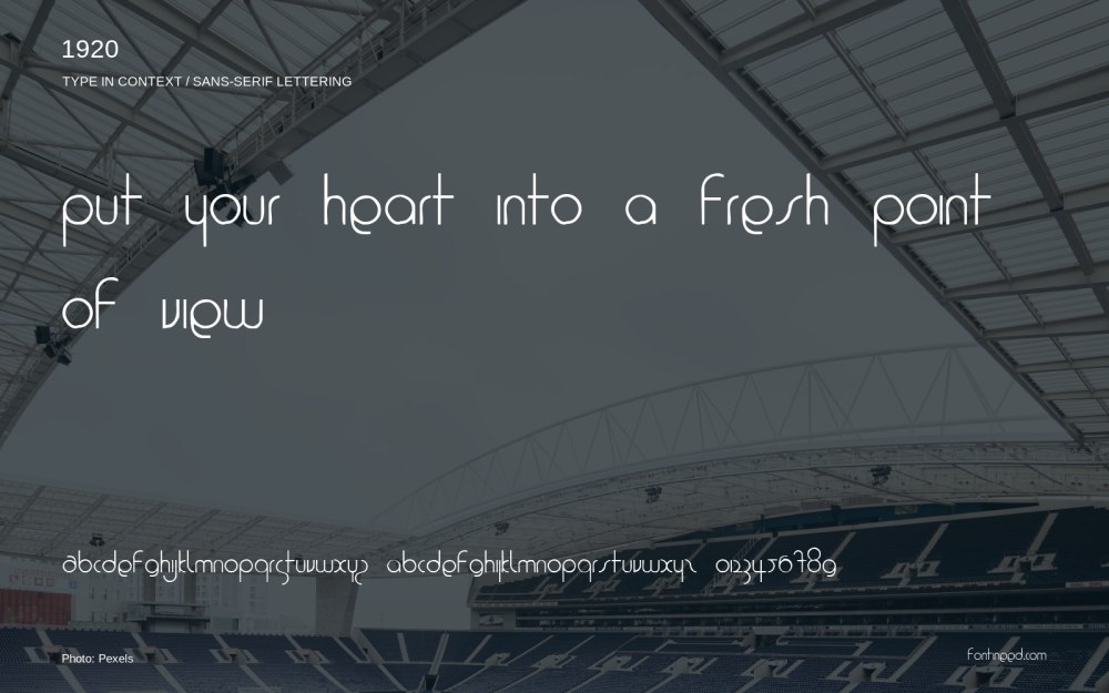
Newly Added Fonts
Recently added to the FontIneed catalog.


