Hanson Bold
Creator: Hanson Method
Hanson Bold in use
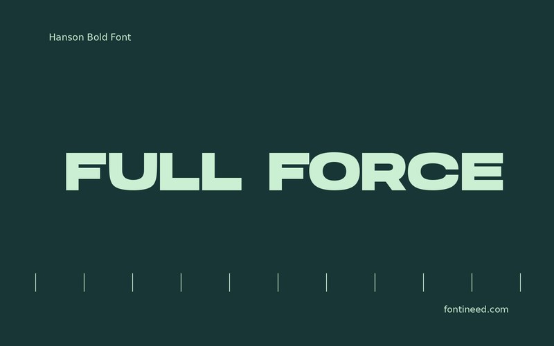
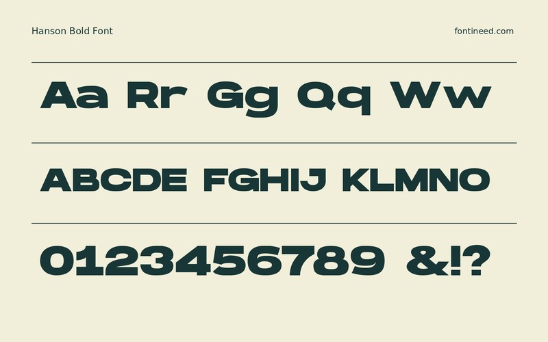
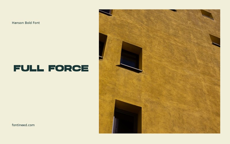
Hanson Bold takes a short uppercase title and makes it occupy a confident block. The softened details keep that block from feeling as hard as its weight might suggest. I’d try “FULL FORCE” on a compact poster where one shape needs to be visible before a date or partner mark.
I can see it doing well as a local team name with several longer sponsor labels underneath. The relative scale of those blocks makes a stronger hierarchy than shading both equally. Check the tightest groups of letters with one flat color before adding effects. A long title may work better split at a meaningful pause. Reserve a predictable corner for details and let the dense headline take its own area. The proportion of those two parts matters more than filling every gap.

Download Hanson Bold
ZIP archive
Similar Fonts
Related catalog styles; compare the characters and license before choosing.
Newly Added Fonts
Recently added to the FontIneed catalog.


