Gilroy
Creator: Radomir Tinkov

Gilroy in use
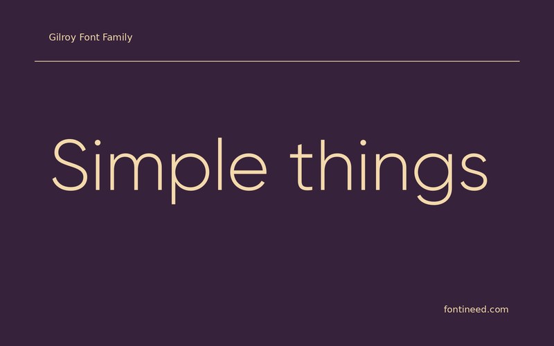
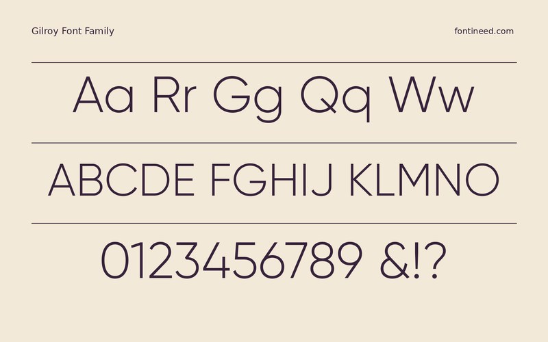
What makes Gilroy useful to me is the clarity of its rounded forms at a range of sizes. I’d try “Simple things” on a product page, first as a large heading and then as a compact navigation label. The lighter sample feels most at home when the surrounding space can do some of the hierarchy work.
If the accompanying details need extra contrast, try a stronger weight on the detail that matters most. Look at the result on a narrow screen before choosing tracking. A geometric sans can make a layout look orderly, and the reader still needs a clear way into the most important action. A wide section heading in the lighter cut can be an elegant departure from a row of small controls. Match those two roles with spacing before trying to express everything through weight.

Download Gilroy
ZIP archive
Similar Fonts
Related catalog styles; compare the characters and license before choosing.
Newly Added Fonts
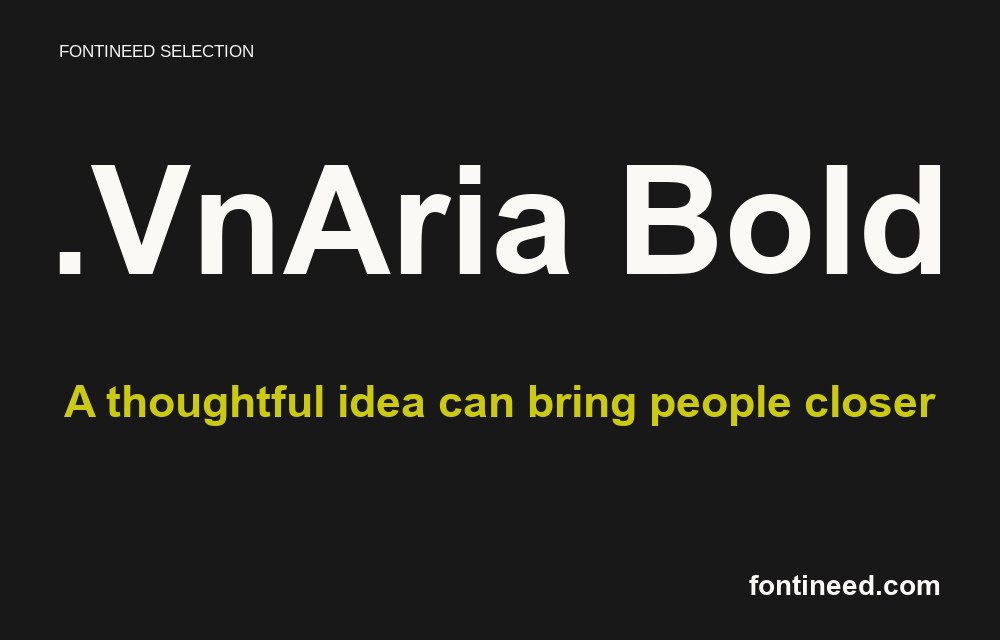
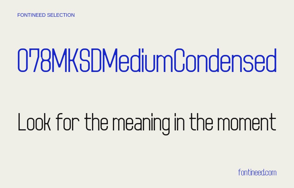
Recently added to the FontIneed catalog.


