GeogrotSharp
Creator: Emtype Foundry
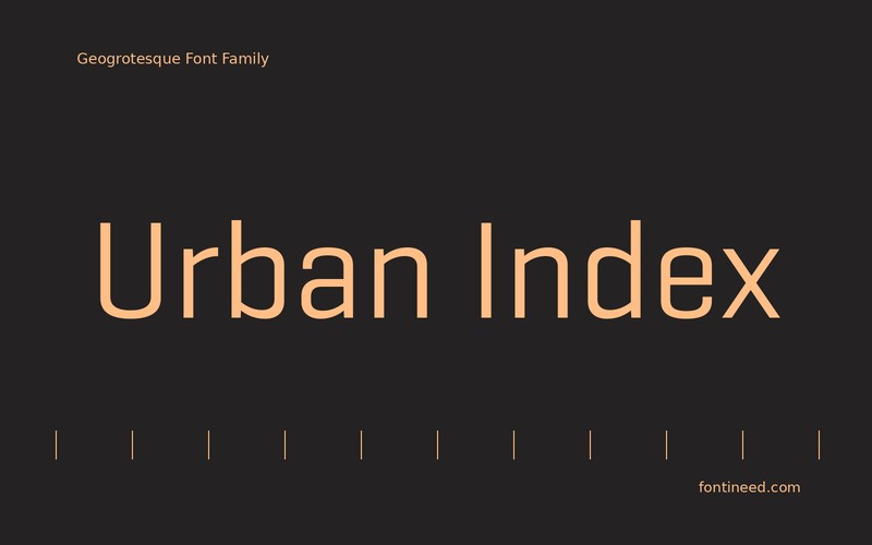
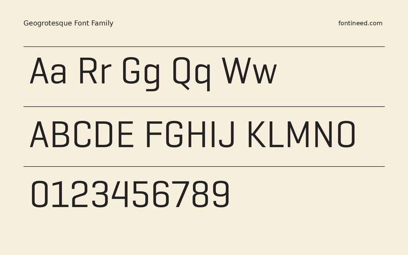
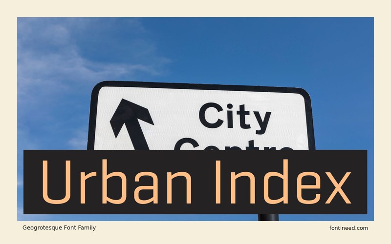
GeogrotSharp in use
The sample in this package is GeogrotSharp, a condensed grotesque whose disciplined shapes let closely related labels line up without feeling mechanical. On an urban index, I’d set street names and floor labels at the same size, then compare how “East Wing” and “South Gallery” occupy their columns. The compact proportions can help the longer entry stay on one line. A good walk-through might include the numbering on a door, a directional arrow, and a caption under a map. The lettering should keep its proportions consistent across all three pieces.
Bring the desired amount of separation back with space between groups. In a dense map, I’d use light rules or a change in weight at the group boundary so the editorial hierarchy remains legible from a distance.

Download GeogrotSharp
ZIP archive
Similar Fonts
Related catalog styles; compare the characters and license before choosing.
Newly Added Fonts
Recently added to the FontIneed catalog.


