Fontuna stencil Display
Creator: NREY
Fontuna stencil Display in use
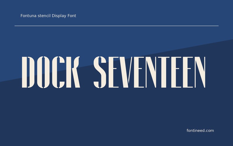
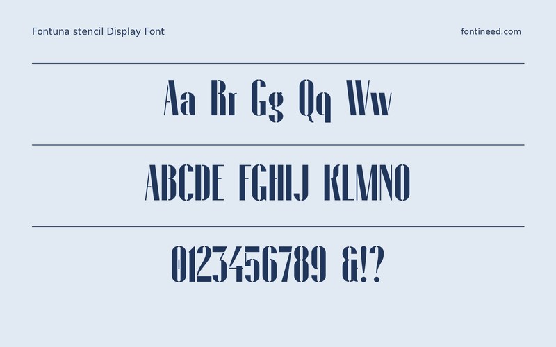
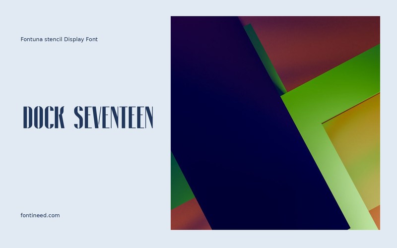
Fontuna makes gaps in the letters part of the visual vocabulary. On “DOCK SEVENTEEN,” those interruptions can suggest a numbered industrial sign without borrowing a background texture. I’d use it for a compact heading where the viewer has space to recognize the silhouettes.
Check the smallest version first. The gaps need to stay visible while each word still reads at a glance. On a poster, keep the lower lines in a more continuous face. This gives the information a regular rhythm and lets the stencil effect carry the association with equipment or location on its own.
Stenciled shapes make particularly good location markers when a project uses a sequence of names. Keep the lengths realistic in the preview and compare how the first letter leads into each one.

Download Fontuna stencil Display
ZIP archive
Similar Fonts
Related catalog styles; compare the characters and license before choosing.
Newly Added Fonts
Recently added to the FontIneed catalog.


