Exodus
Creator: Andrew Herndon
Exodus in use
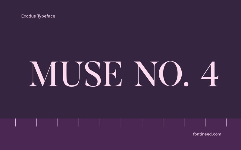
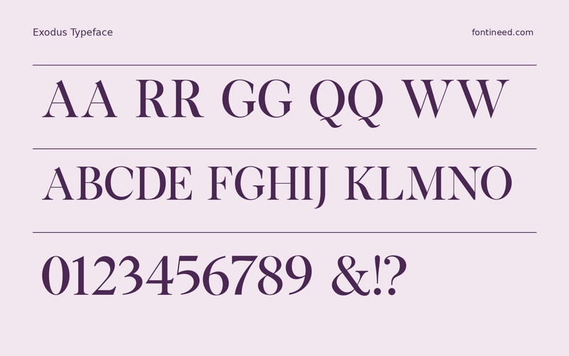
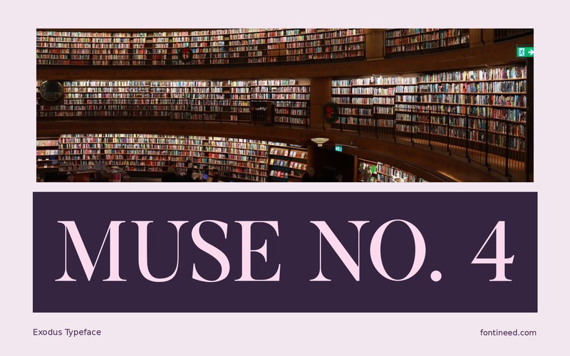
Exodus gives a display composition several interpretations of the same lettering. For the regular design, I’d start with “MUSE” as the cover title and leave the more decorative files for an issue mark or a small change in the next cover. It can make a short run of covers feel related while giving each one an individual detail.
Match the settings by looking at optical weight, especially if you put two variants side by side. Their decorative details can change how dark a row appears. A plain line of supporting information will keep the viewer’s eye moving from the main title to the practical details.
For a series, print the covers next to one another. A small reference line can carry continuity between issues while the cuts offer individual choices for the most important headline.

Download Exodus
ZIP archive
Similar Fonts
Related catalog styles; compare the characters and license before choosing.




Newly Added Fonts
Recently added to the FontIneed catalog.


