Estrella
Creator: Uncarving
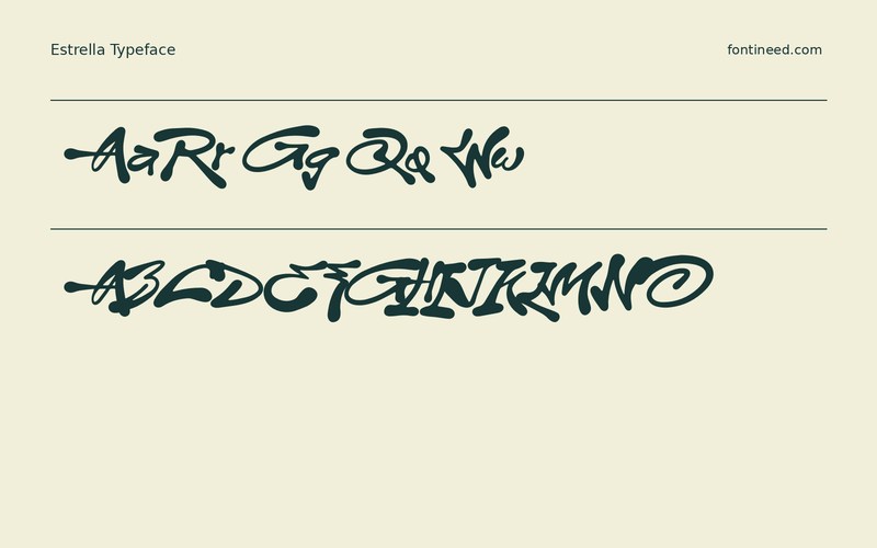
Estrella in use
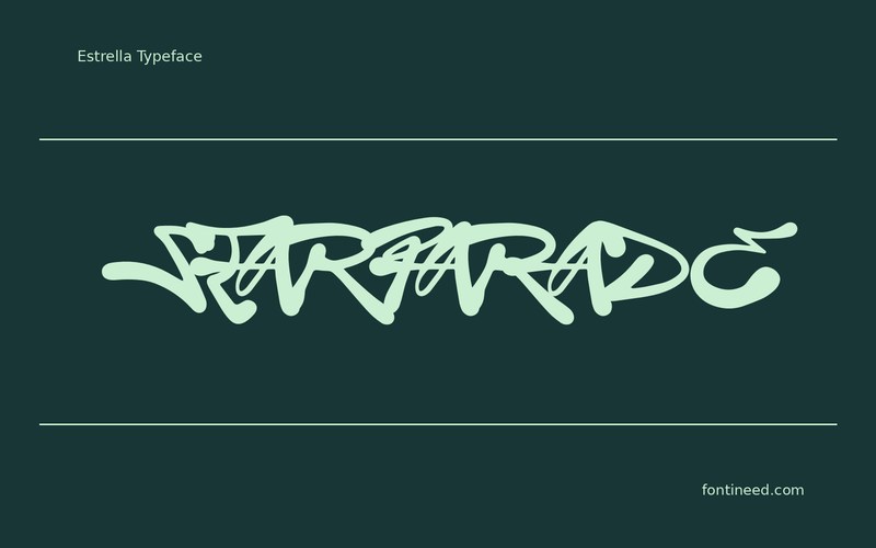
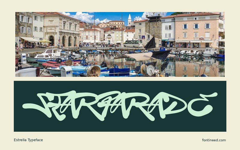
Estrella’s contour has enough character to become the subject of a small poster. “STAR PARADE” gives the lettering some room to run, and the words can hold a two-color design with no other visual theme. I’d let the curves lead the balance of the composition. Try placing the poster where it will be seen alongside real competition. The distinguishing curves can hold the composition together even when the extra small text is allowed a quiet role.
Look at how the line reads on a crowded wall and again in a square preview. If it needs a shorter line, change the arrangement instead of flattening the forms. Dates and prices can sit in a clear grid. One exuberant line is enough to give the rest of the layout a different rhythm.

Download Estrella
ZIP archive
Similar Fonts
Related catalog styles; compare the characters and license before choosing.
Newly Added Fonts
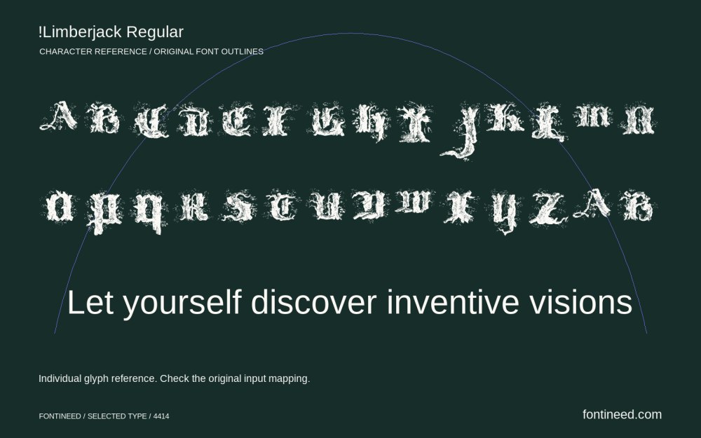
Recently added to the FontIneed catalog.


