Druk
Creator: Berton Hasebe
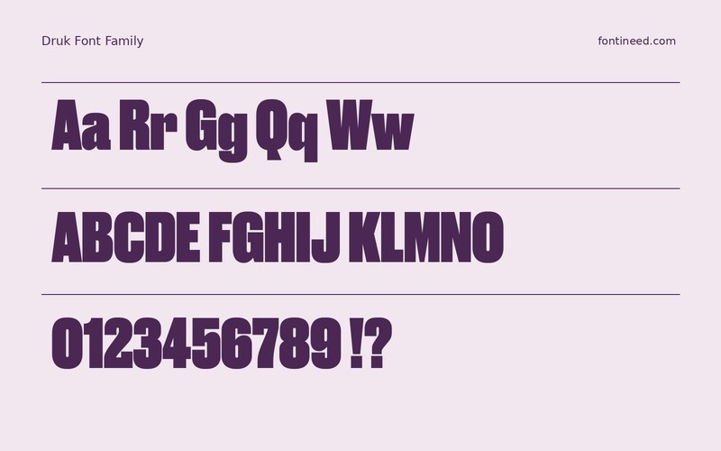

Druk in use
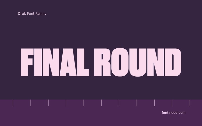
Druk is the point in a composition where the reading pace changes. Set “FINAL ROUND” in a heavy sample and the headline puts a strip of black across the poster before the viewer reads the event details. On a sports graphic, this gives the action a clear first layer.
Test the same words from farther away as well as on a phone. Give narrow interior spaces the contrast they need to survive at the smallest size. I’d keep the next line shorter and lighter and put it a little farther away. That distance can make the headline feel more decisive than another weight change would. Give the field of ink somewhere to stop. On a tall print, putting a smaller rule or block directly below the dark headline can help the eye settle and make the date feel more accessible.

Download Druk
ZIP archive
Similar Fonts
Related catalog styles; compare the characters and license before choosing.


Newly Added Fonts
Recently added to the FontIneed catalog.


