Didot
Creator: Linotype

Didot in use
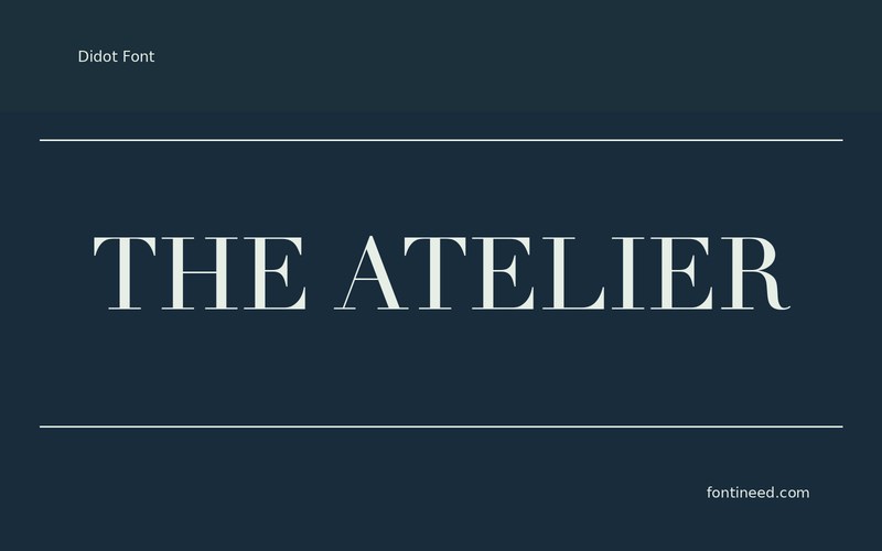
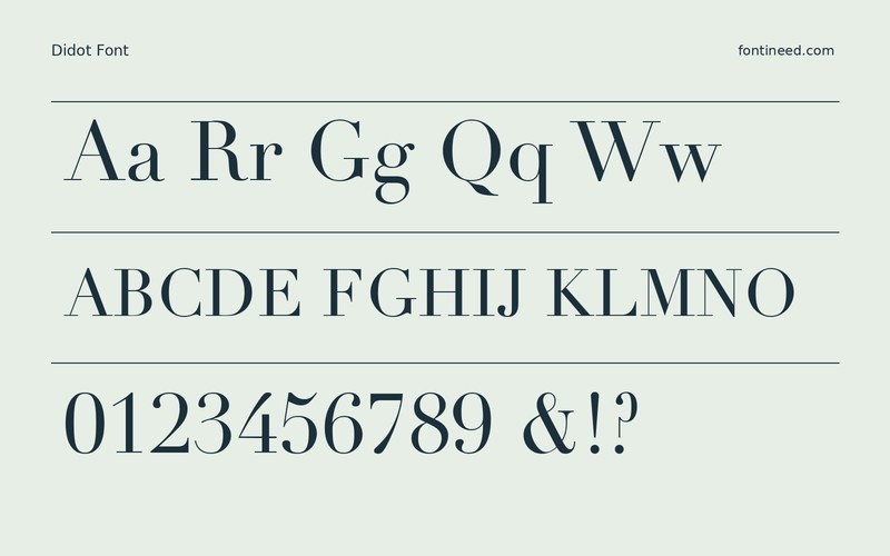
Didot makes the eye move between very fine strokes and upright dark ones. Large type can turn that difference into part of the atmosphere of an editorial spread. I’d place “THE ATELIER” on a page where the text has more than one way to catch the light, such as above a quiet photograph.
Make a small print proof before settling the final size. The most delicate lines are where I look first, especially if they sit close to another thin detail in the image. Keep the body copy in a size and face suited to sustained reading. Let the display line keep its own measured pace.
A screen shot of the smallest crop can help choose the line break. Where a fine stroke is important to a word, give it a clear job in the composition.

Download unavailable
This catalog entry is available for reference. A downloadable font file is not currently offered by this page.
Browse fonts with downloadsSimilar Fonts
Related catalog styles; compare the characters and license before choosing.




Newly Added Fonts
Recently added to the FontIneed catalog.


