Cylburn
Creator: Dai Foldes
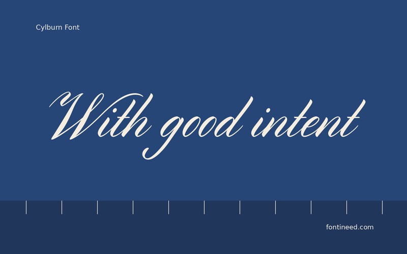
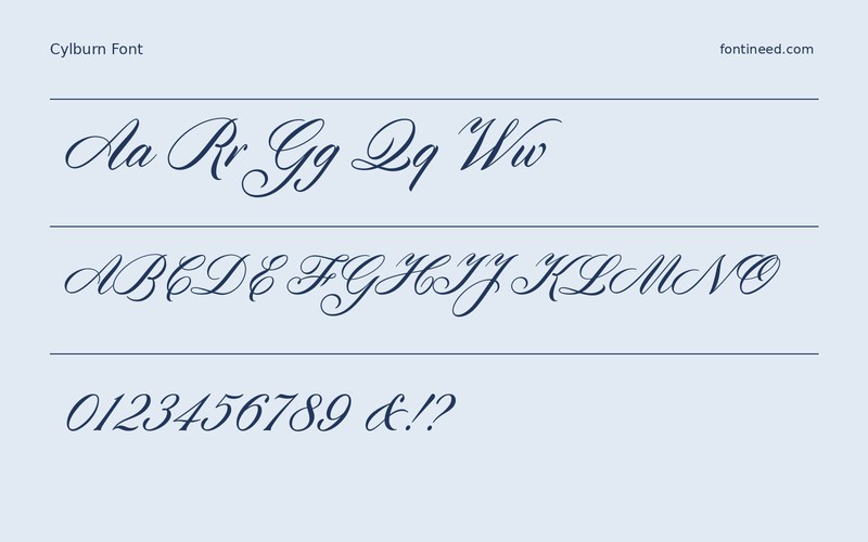

Cylburn in use
Cylburn is a good reminder that handwriting can feel expressive even when the joins are restrained. I’d use “With good intent” as a short line at the bottom of a card, where a change of pace can make a formal note feel more direct. The pauses between shapes contribute to that voice. On a folded note, a second quiet use can sit just above the signature area. Make it clear that the tiny letters still belong to a voice the reader is meant to notice.
Make a close proof of the two words that sit nearest each other. Look at how the word spaces hold once the line is in the final layout. Keep the address where a reader expects to find it and let the handwritten line be something they can read at a different pace.

Download Cylburn
ZIP archive
Similar Fonts
Related catalog styles; compare the characters and license before choosing.
Newly Added Fonts
Recently added to the FontIneed catalog.


