Coco
Creator: Franco Fernández
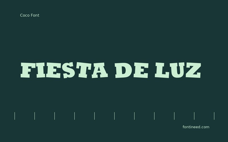
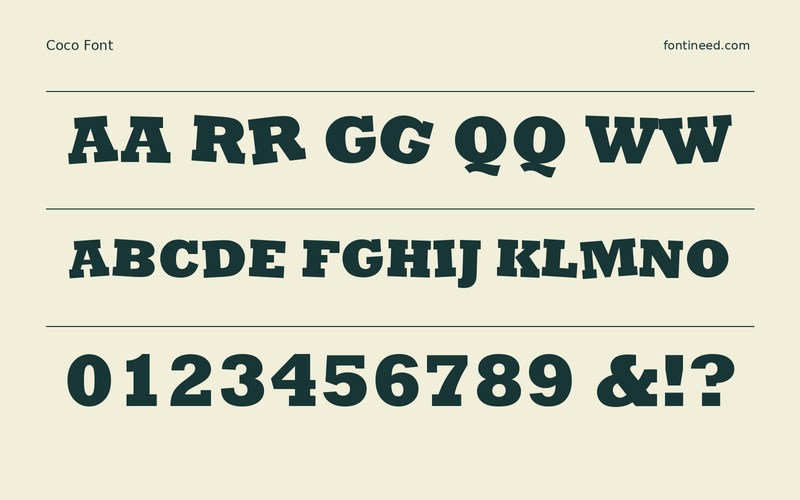
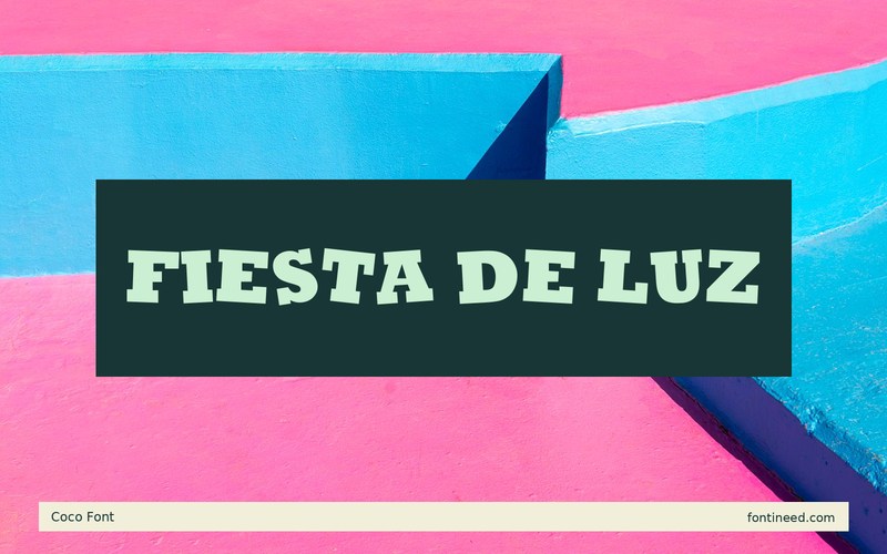
Coco in use
Coco works best for me as an eye-catching title with some movement in its silhouette. I’d set “FIESTA DE LUZ” across two lines so the different word lengths help direct the eye. The title can carry a playful mood on an otherwise straightforward poster. For a second version on a phone, simplify the background near the middle of the word. The changing height of the forms will already supply some of the poster’s movement.
The question I’d ask of the proof is whether each word still reads before the illustration catches up with it. Give the name a steady background and put the time and venue in a face with a predictable rhythm. Printed in a single color, the lettering should still be able to hold the center of the design.

Download Coco
ZIP archive
Similar Fonts
Related catalog styles; compare the characters and license before choosing.
More by Franco Fernández
Explore other catalog entries credited to this designer.

Newly Added Fonts
Recently added to the FontIneed catalog.


