Clash Display
Creator: Indian Type Foundry
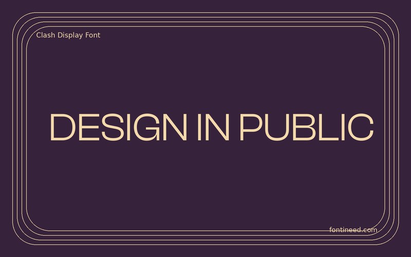
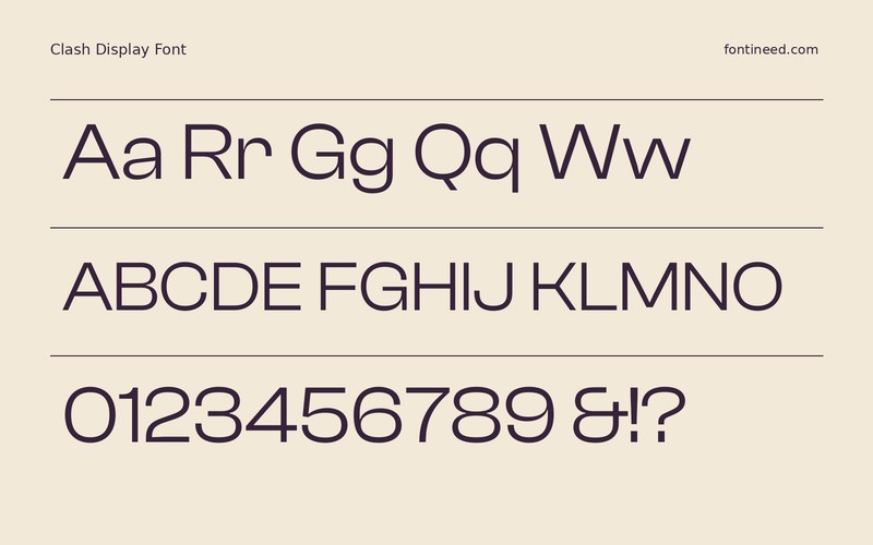
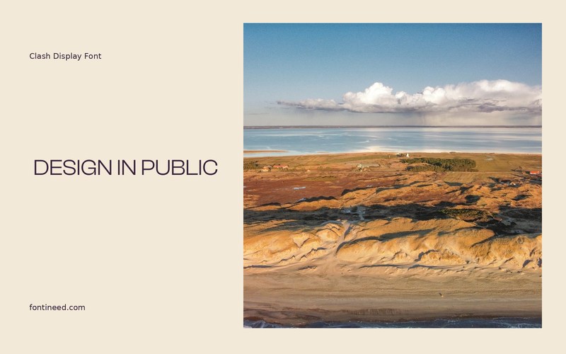
Clash Display in use
Clash Display works best for me with a phrase that is long enough to expose its changes in shape. “DESIGN IN PUBLIC” is a useful test for a studio poster or homepage header because it has both short and long groups of letters. A plain composition will show whether that tension feels right.
I’d test a capital line and the mixed-case name before settling on the visual system. They can come across quite differently once there is an actual heading hierarchy below them. Try the same line at a thumbnail size and a size where the design takes up much of the screen. Then add just one smaller line to tell the reader what the page is for. I’d reserve the face for the strongest statements, where the distinctive drawing can reward a closer look.

Download Clash Display
ZIP archive
Similar Fonts
Related catalog styles; compare the characters and license before choosing.
More by Indian Type Foundry
Explore other catalog entries credited to this designer.


Newly Added Fonts
Recently added to the FontIneed catalog.


