Cindie Mono
Creator: Lewis McGuffie Type
Cindie Mono in use
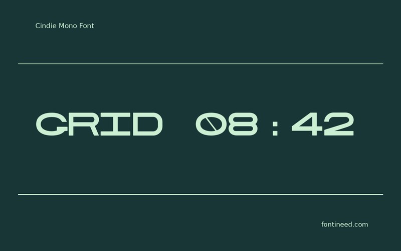
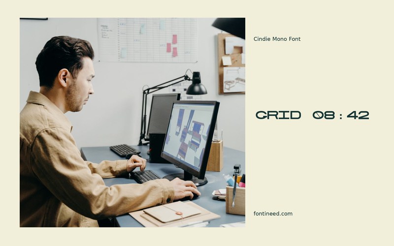
Cindie Mono makes the alignment of a title feel like part of the idea. “GRID 08:42” gives numbers and letters a shared structural role, useful in a poster that borrows its visual language from interfaces or labels. I’d place that title beside a small column of coordinates to reinforce the link.
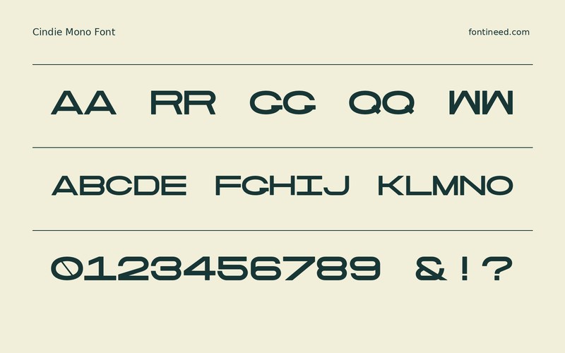
Test with the actual numbers it will have to carry. Compare similar digits and look at punctuation at the smallest size where it appears. If the display needs to be read fast, keep the signal as one line and put surrounding data in its own row. The regularity can then give the composition a recognizable beat. A second useful proof is a stack of short times and coordinates. Their repeated alignment shows up in a glance, especially against a less rigid line of explanatory copy.

Download Cindie Mono
ZIP archive
Similar Fonts
Related catalog styles; compare the characters and license before choosing.


Newly Added Fonts
Recently added to the FontIneed catalog.


