BEYNO
Creator: Fabian Korn
BEYNO in use
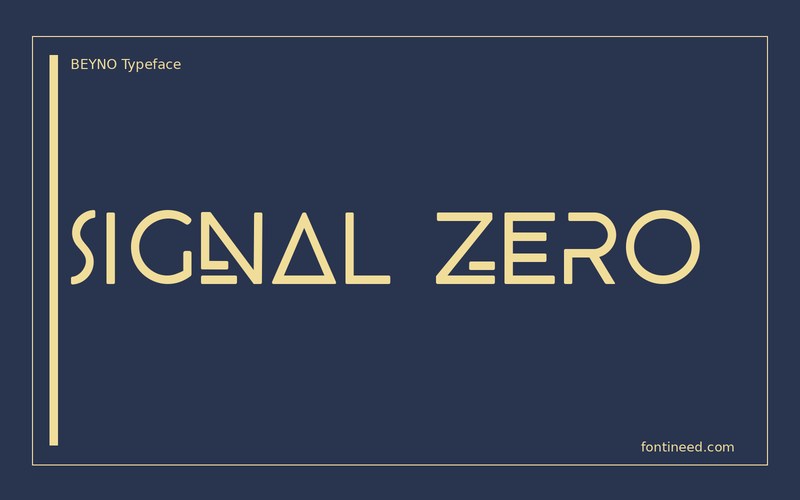
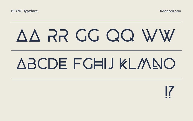
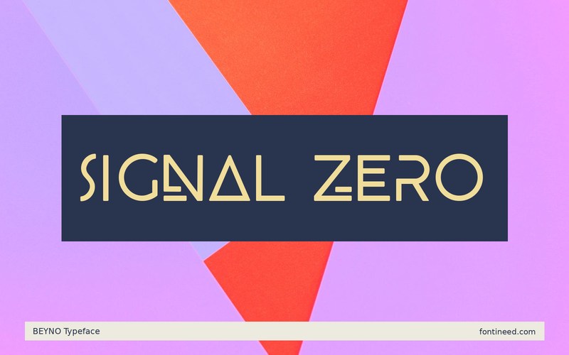
The first thing I notice in BEYNO is how the letters change the silhouette of the word. The angular breaks make a short headline such as “SIGNAL ZERO” read a little like a piece of equipment with its own symbols. At a large scale, that provides visual identity even when the palette is limited to two colors.
A checked floor plan or game loading screen would give the angular forms a reason to be there. For a softer setting, I’d move on to a different display face. Give each letter enough contrast to make sense on the first read. I’d test the line with a plain background before introducing scan effects or texture. A clean sans for the rules, date or coordinates lets BEYNO carry the visual language by itself.

Download BEYNO
ZIP archive
Similar Fonts
Related catalog styles; compare the characters and license before choosing.
Newly Added Fonts
Recently added to the FontIneed catalog.


