Amsterdam Signature
Creator: Lettersiro
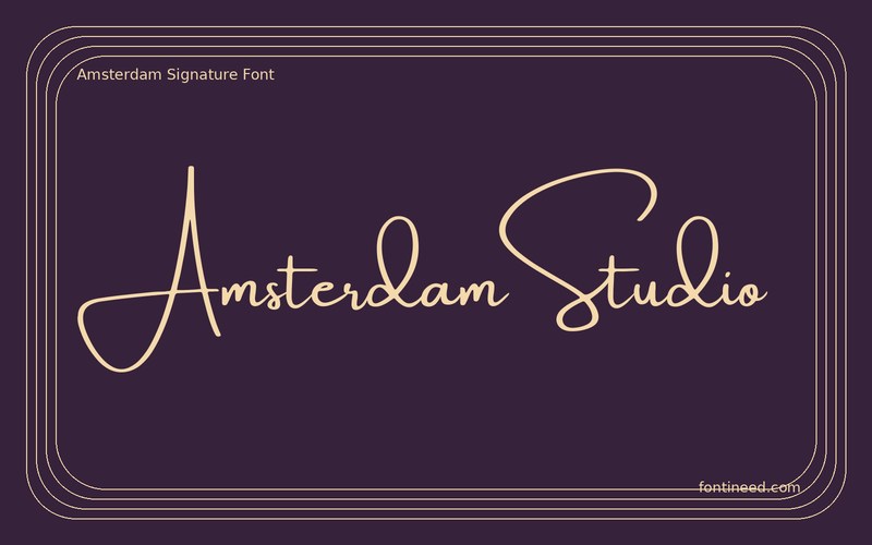
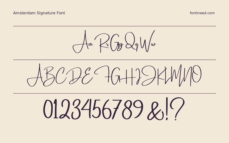
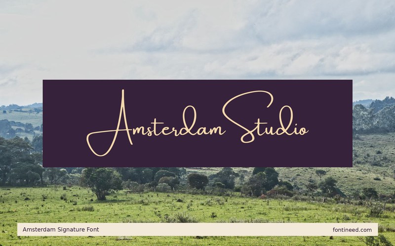
Amsterdam Signature in use
With the Amsterdam sample, I’d start by writing a full name instead of a single display word. A signature face earns its place through the balance of a line, like “Amsterdam Studio” sitting beside the edge of a photo. Its quicker strokes let a credit feel closer to a mark than a caption. Choose actual names with different word lengths when making the first signature system. That reveals quickly whether the placement allows the largest strokes to have the clearance they need.
Make the smallest watermark first and compare it on the darkest photograph in the set. If the name needs help, try changing its position or the color under it. Leave the website and location in a more even upright voice, especially when they need to remain legible across several crops.

Download unavailable
This catalog entry is available for reference. A downloadable font file is not currently offered by this page.
Browse fonts with downloadsSimilar Fonts
Related catalog styles; compare the characters and license before choosing.

More by Lettersiro
Explore other catalog entries credited to this designer.

Newly Added Fonts
Recently added to the FontIneed catalog.


