Alexana Display
Creator: Mark Mora
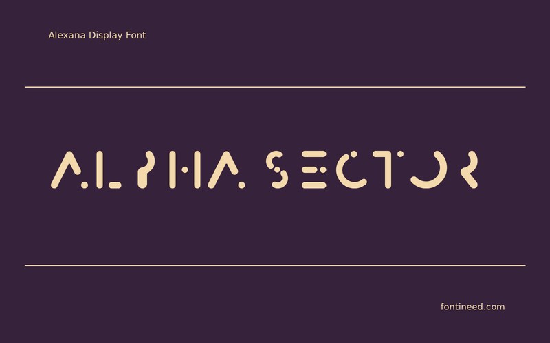
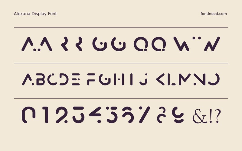
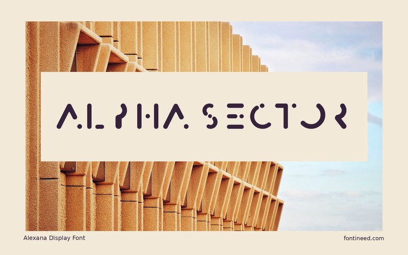
Alexana Display in use
Alexana addresses the eye in a series of angular interruptions. Its letter shapes can give a title such as “ALPHA SECTOR” a specific graphic accent, especially when the rest of an interface is built from clean lines. It suits a title screen or chapter card where the reader has a moment to look at the name.
Consider a second single-word title for a different section of the same project. If one breaks into a convincing outline and the other stalls, use the font only where the letter shapes cooperate. I try this kind of display face first at the size it will appear in a thumbnail. At small scale, the breaks should remain intentional. Give the accented line a straight role in the layout and handle secondary text with a plain face that carries the same alignment.

Download Alexana Display
ZIP archive
Similar Fonts
Related catalog styles; compare the characters and license before choosing.
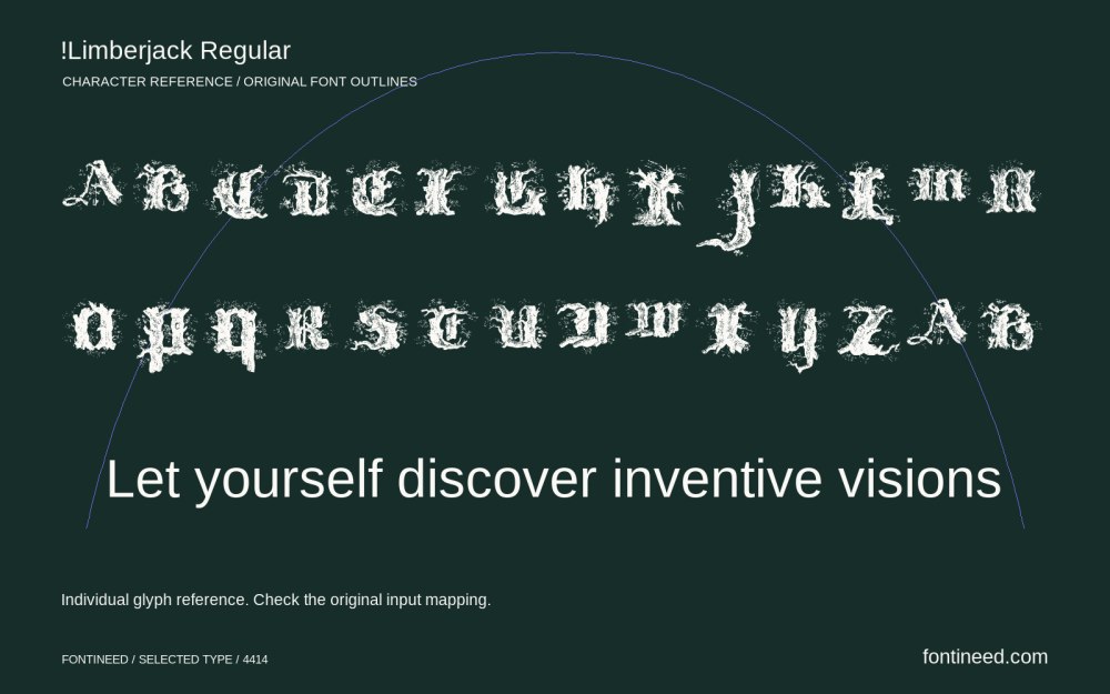
Newly Added Fonts
Recently added to the FontIneed catalog.


