Akt
Creator: Dmitry Grenev
Type Tester
Akt
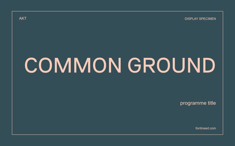
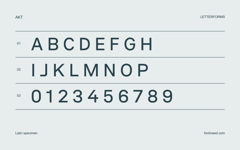
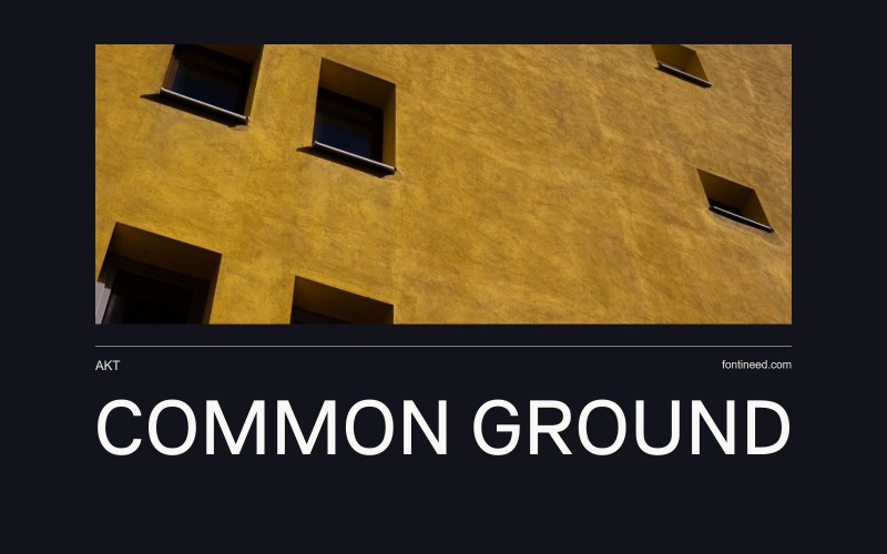
Akt in use
Akt’s evenly paced capitals make a label feel composed, even when the surrounding layout is busy. The round forms are generous enough to sit beside straighter characters without breaking the line into abrupt changes of width. An exhibition with a large entrance title and small room markers is exactly where I’d want that composure. Start with an actual location name and its reference number. The forecast for the whole system is how naturally those two pieces sit together.

Compare sizes
Character sample
A sample of common input positions. Symbol and legacy-encoded files may show other shapes or missing characters.
Download Akt
Check license file. An archive readme may contain installation instructions only; check the creator’s usage terms before use.
Similar Fonts
Related catalog styles; compare the characters and license before choosing.

Newly Added Fonts
Recently added to the FontIneed catalog.


