Ailerons
Creator: Ailerons Typeface
Ailerons in use
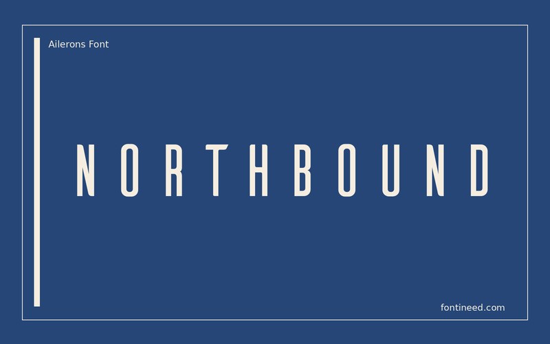
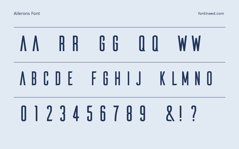
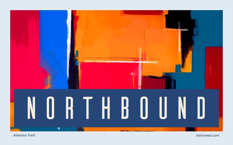
Ailerons works as the typographic equivalent of a tall, quiet title card. The slim forms and their spacing give “NORTHBOUND” an air of distance. I’d place it above a wide photograph and let the composition draw a relationship between the horizon and the long line of letters. For a station card or travel poster, place the subtitle farther away than feels necessary on a desktop preview. At the finished size that margin helps preserve the quiet pace of the title.
Try the name on a small thumbnail where there is very little room for a full-length heading. If the title shrinks too far, move the subtitle to another area. Preserving some of the space within the main line keeps the sense of scale that made it work at full size.

Download Ailerons
ZIP archive
Similar Fonts
Related catalog styles; compare the characters and license before choosing.
Newly Added Fonts
Recently added to the FontIneed catalog.


