Agrandir
Creator: Alex Slobzheninov
Agrandir in use
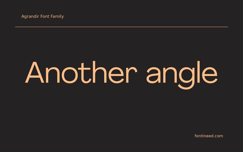
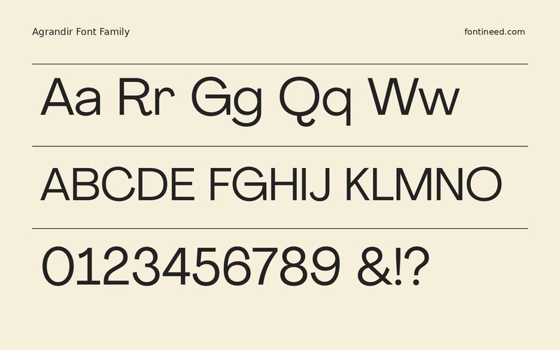
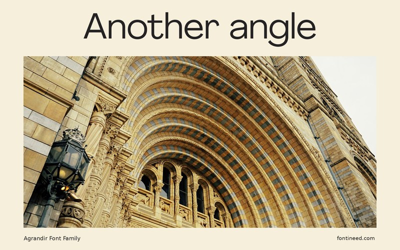
Agrandir is appealing when geometric letters can be allowed a little personality. I’d test “Another angle” as a short web headline and then try it in a button or caption at the same comfortable size as neighboring text. The difference between those two roles tells you where to let its character forward. For a brand study, compare an interior screen with a large home page hero. The more distinctive curves tell you where the name can work hardest without changing the smaller typography.
Set a simple grid first. Avoid letting each line claim the same degree of attention. On a broad layout, a distinctive headline can anchor the system, while the smaller writing has the practical job of getting someone to the next section. Give each role enough space to do that.

Download Agrandir
ZIP archive
Similar Fonts
Related catalog styles; compare the characters and license before choosing.
Newly Added Fonts
Recently added to the FontIneed catalog.


