Against
Creator: 177Studio
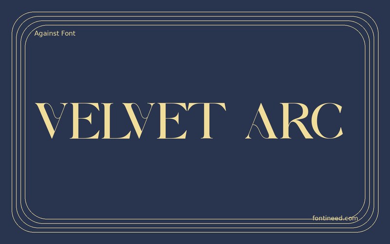
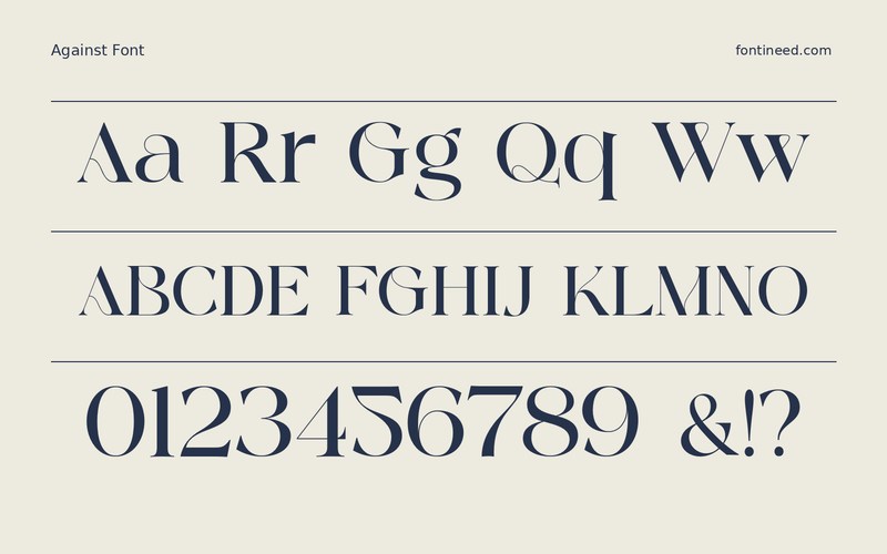
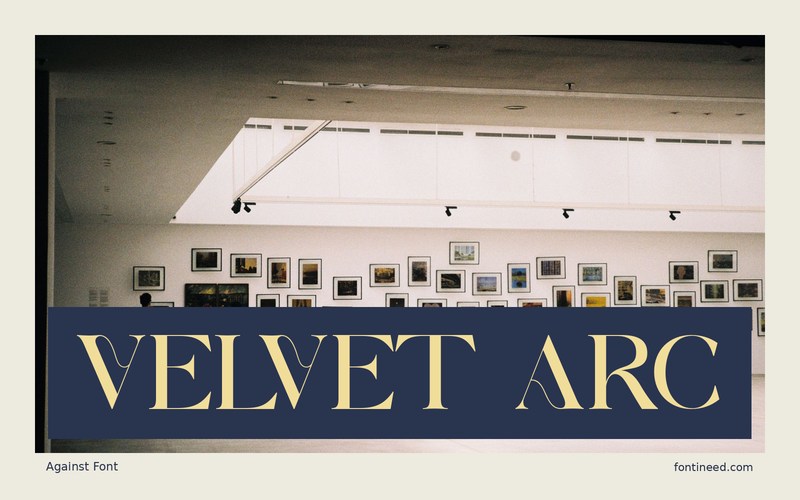
Against in use
Against gives a short serif headline enough shape to work as a wordmark. “VELVET ARC” is the kind of composition where the changing stroke weight can make an otherwise plain title feel carefully considered. I’d try it on a package with a strict color palette so the drawing does most of the work.
An emboss or foil test is worth making early. It should let the fine parts remain legible at the closest viewing size without turning them into the only thing you see. Inspect the thinnest strokes after shrinking the design to label size. Give the title enough separation from any adjacent border and keep the secondary information lighter in tone. When you compare proofs, choose the one whose headline still has contrast at its smallest realistic size.

Download unavailable
This catalog entry is available for reference. A downloadable font file is not currently offered by this page.
Browse fonts with downloadsSimilar Fonts
Related catalog styles; compare the characters and license before choosing.
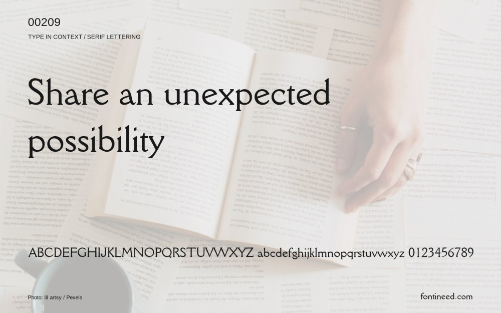


Newly Added Fonts
Recently added to the FontIneed catalog.


