Factoria
Creator: Fort Foundry

Factoria in use
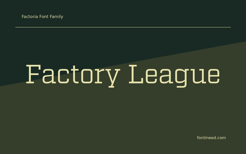
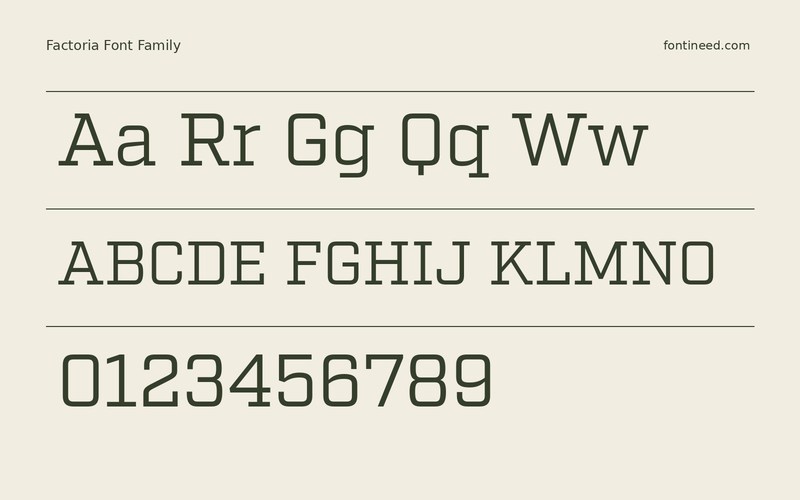
Factoria has a slab structure that makes “Factory League” sit firmly over a photo. The Book sample is useful for finding a place between a bold headline and a smaller facts column. I’d compare several of the associated cuts at the exact size used in the program, then choose the one that keeps the team name legible near the score. This is a stronger test than an isolated word because the title needs to carry weight alongside other information with its own visual demands.
An official program often puts the team name beside a photograph and several numbers. Set those pieces together before choosing the slab weight, so the familiar shape stays distinct from the rest. The slab forms also give the lower line some stability on a wide poster. Keep a little contrast between that secondary line and the most prominent words.

Download Factoria
ZIP archive
Similar Fonts
Related catalog styles; compare the characters and license before choosing.


More by Fort Foundry
Explore other catalog entries credited to this designer.


Newly Added Fonts
Recently added to the FontIneed catalog.


