Abolition
Creator: Fort Foundry
Abolition in use
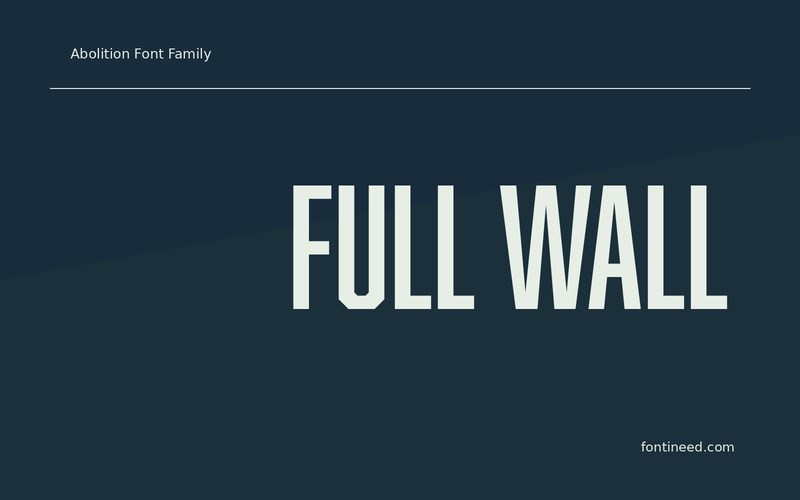
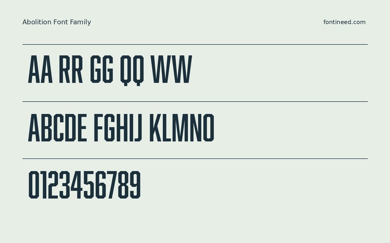
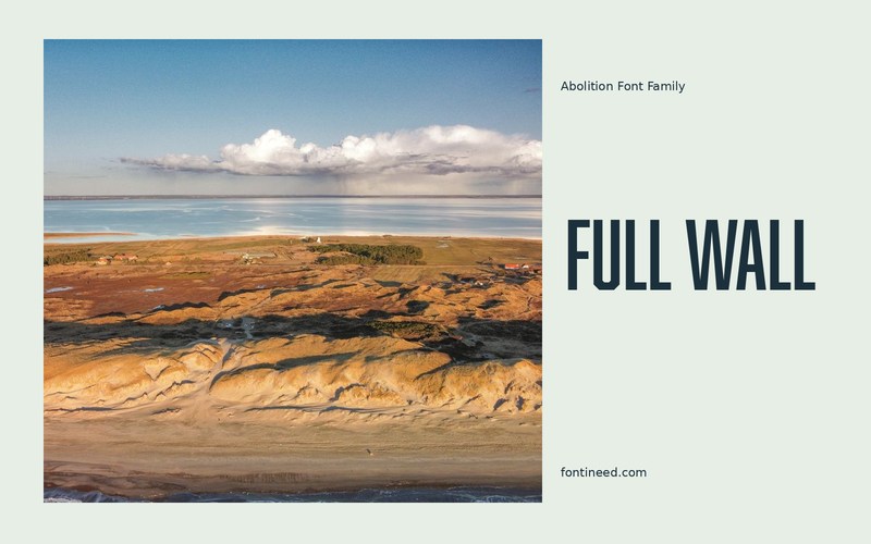
Abolition makes a short headline stretch upward while keeping the composition compact sideways. I’d place “FULL WALL” beside a photograph to see how much height it can take without asking the image to give up width. Compare the print with a narrow social crop and keep the actual headline in both. A simpler row of details gives the title its own area. This is where the condensed design earns its place in an otherwise busy poster.
Two headlines with different lengths make a useful pair of proofs. Let one stack where it needs to, so the tall forms can keep their proportions across the series. In a narrow poster title, try aligning the secondary line with a strong vertical rather than around the whole word. That gives the condensed shape more space and the details a reliable place.

Download Abolition
ZIP archive
Similar Fonts
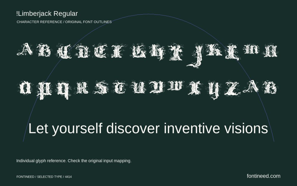
Related catalog styles; compare the characters and license before choosing.
More by Fort Foundry
Explore other catalog entries credited to this designer.


Newly Added Fonts
Recently added to the FontIneed catalog.


