
TTF
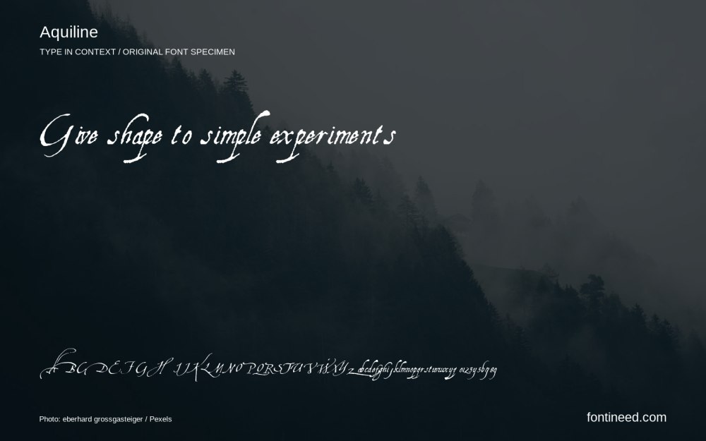
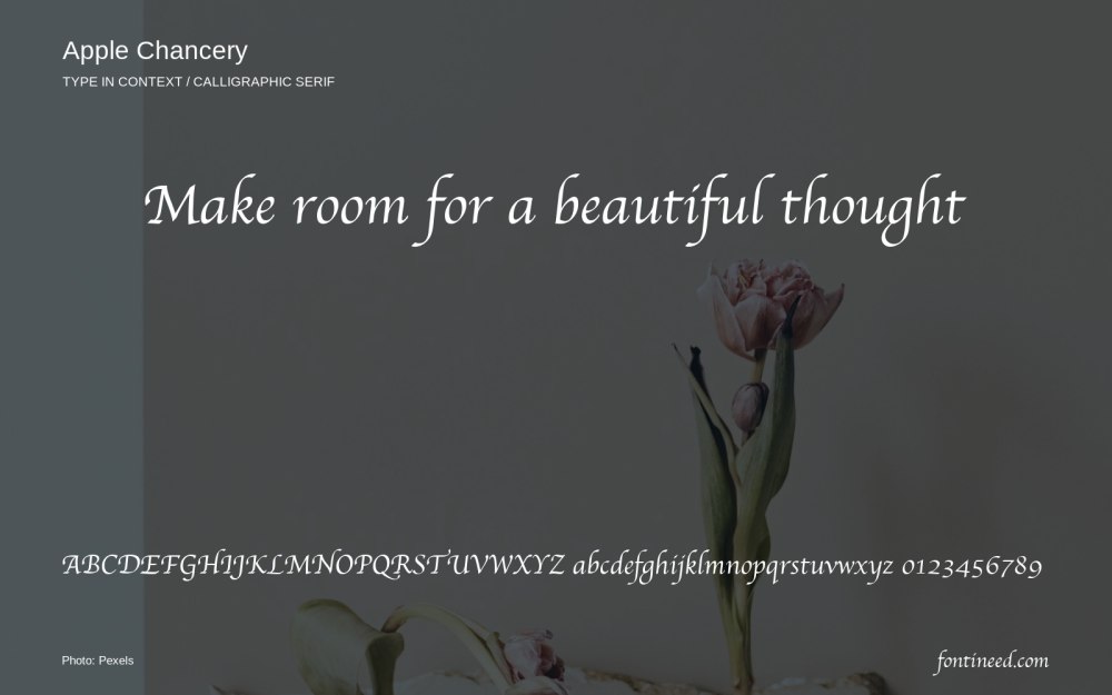
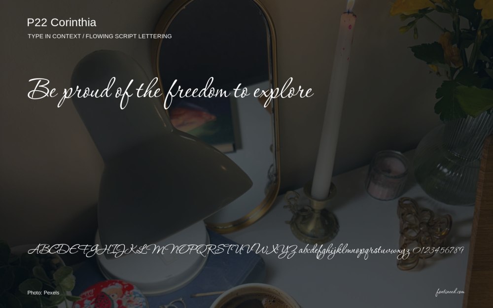
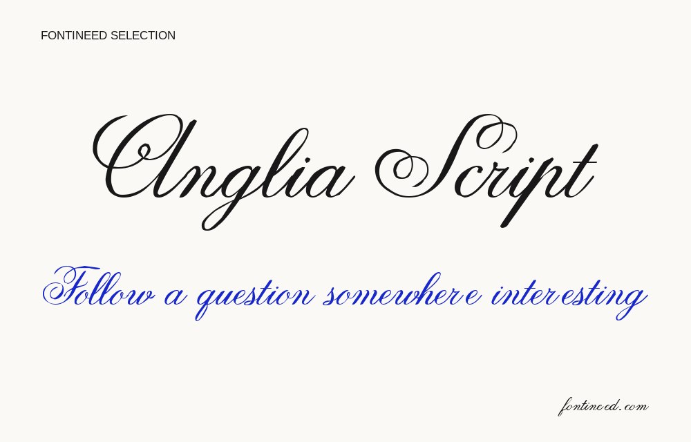
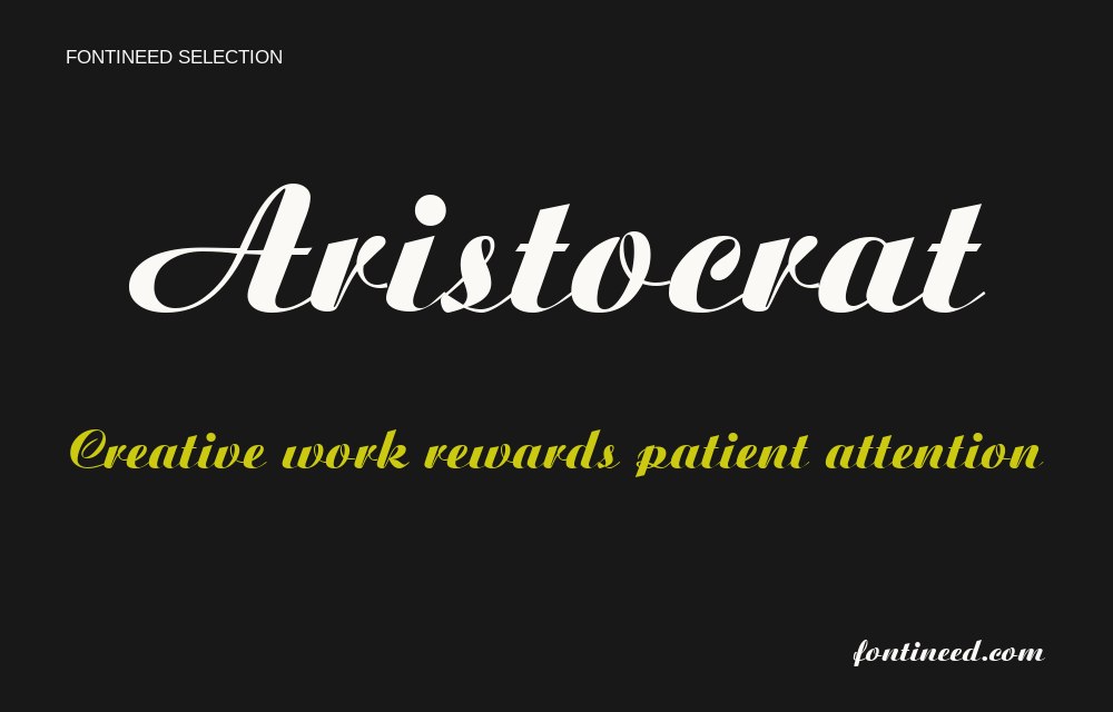
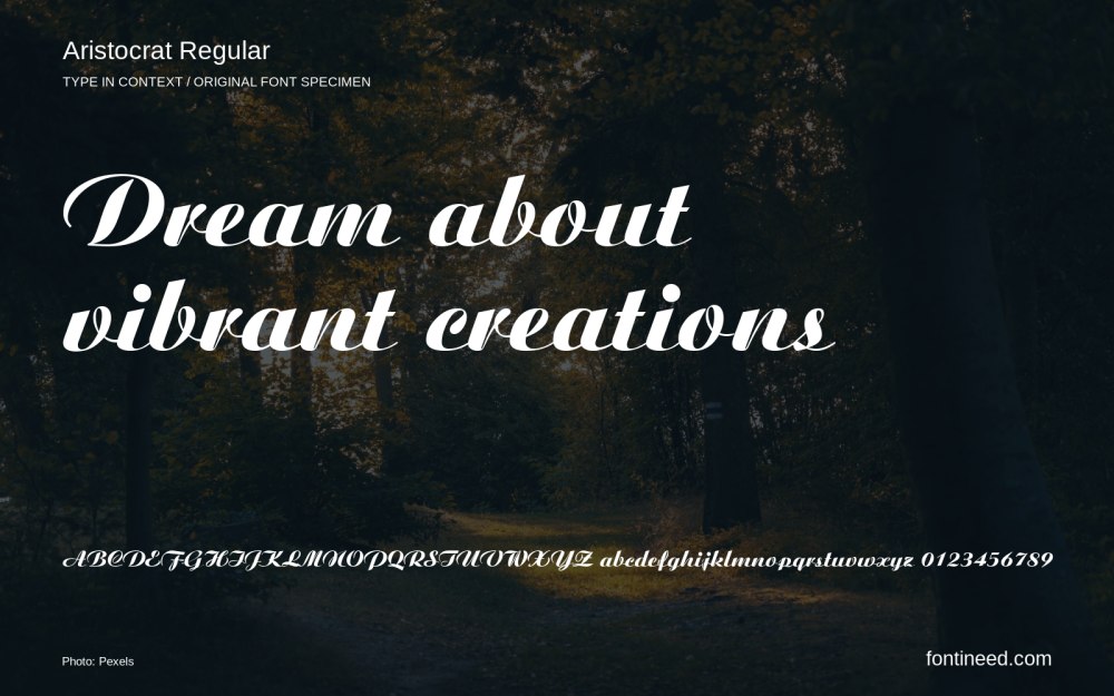
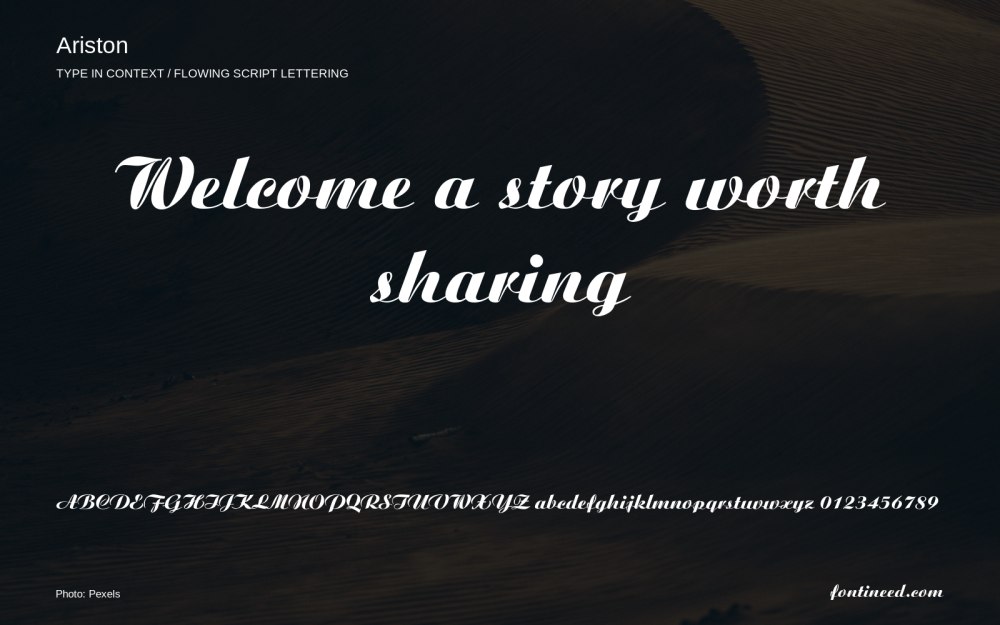
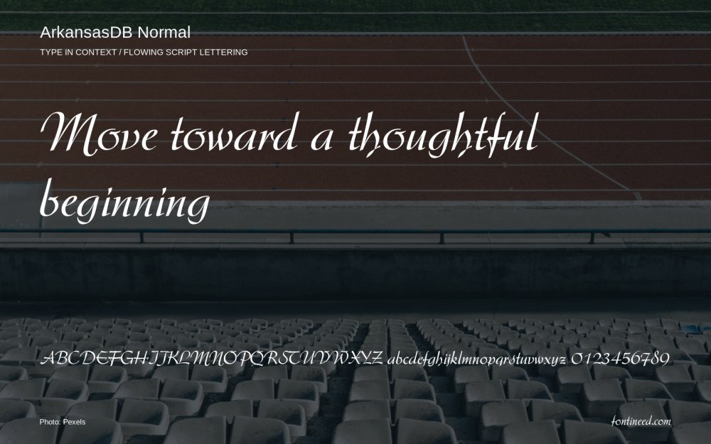
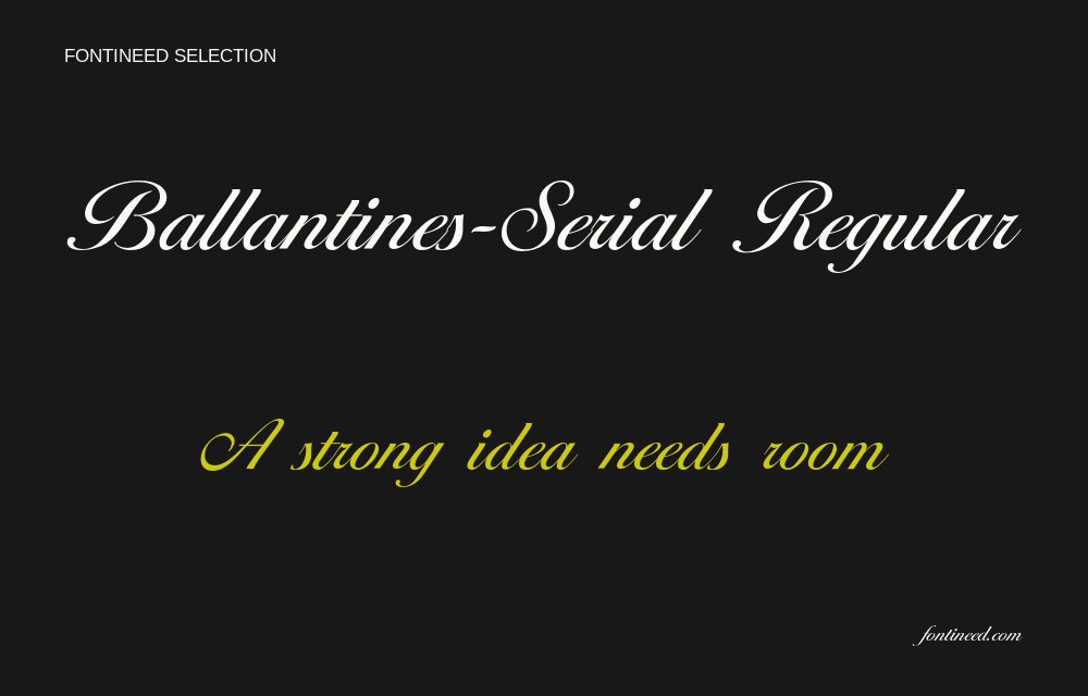
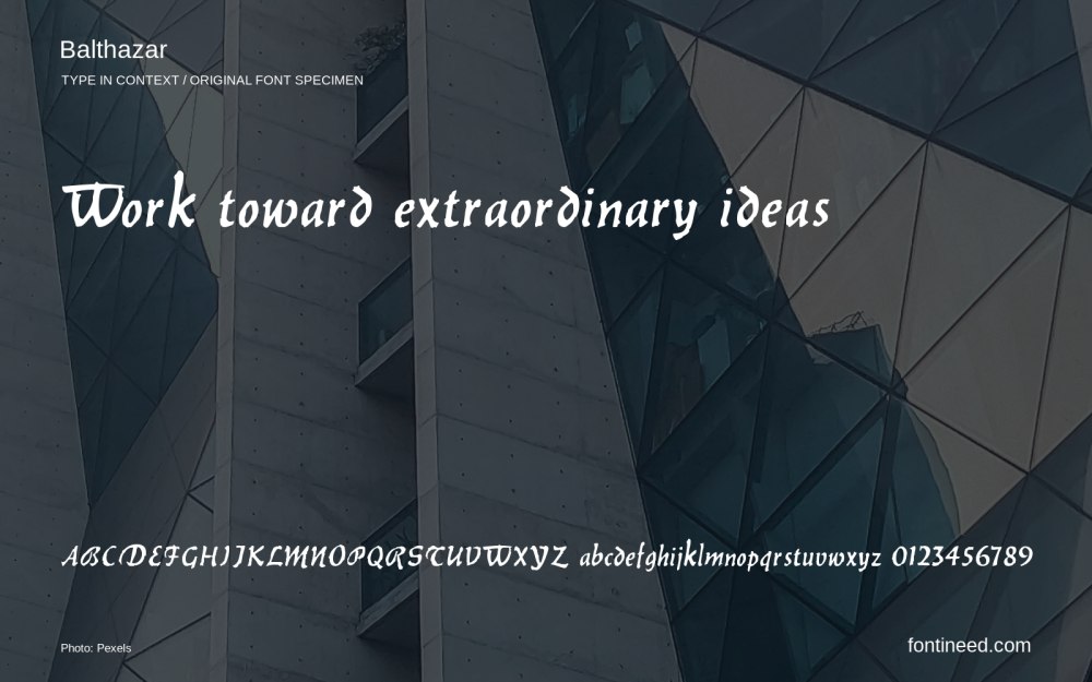
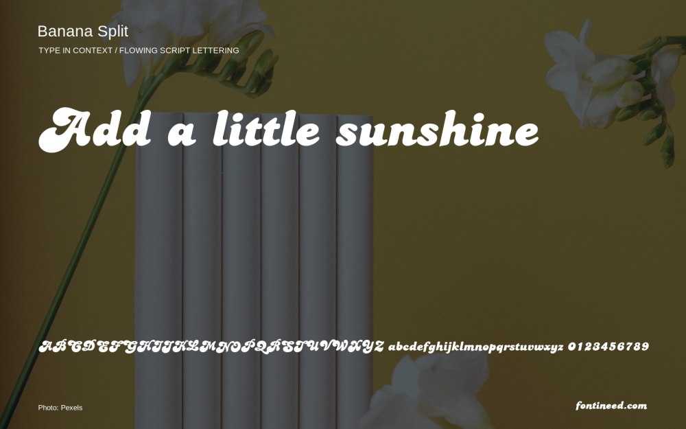
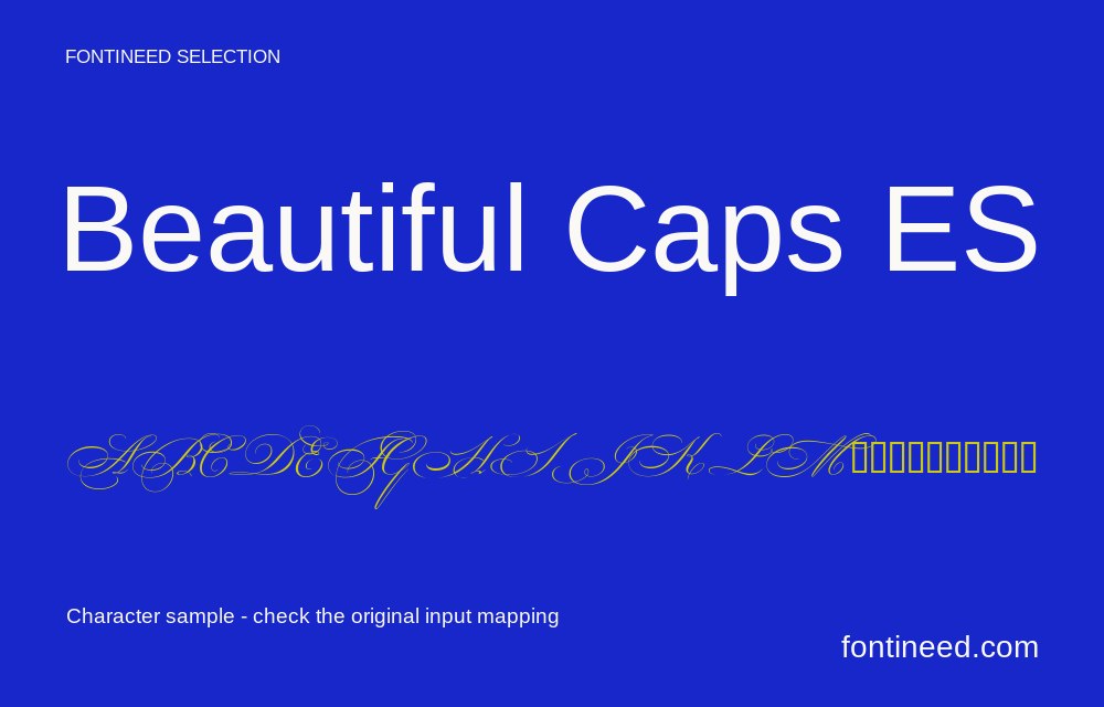
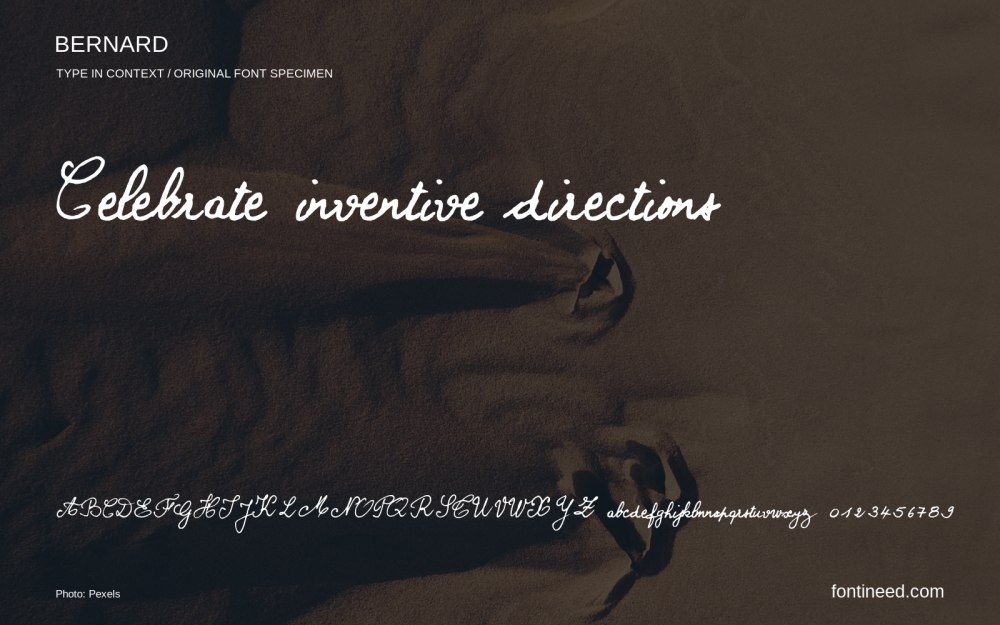
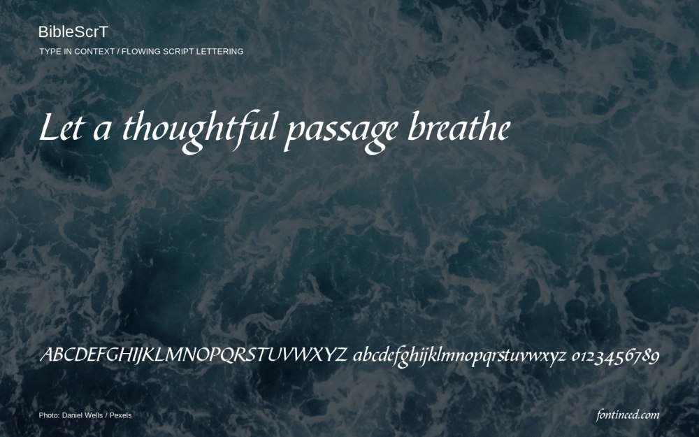
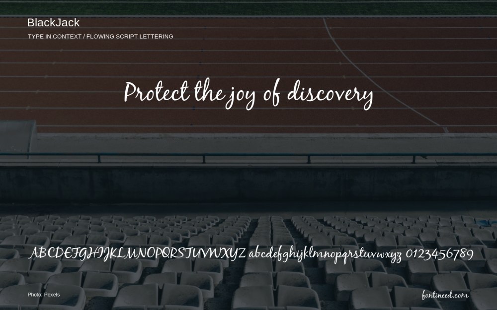
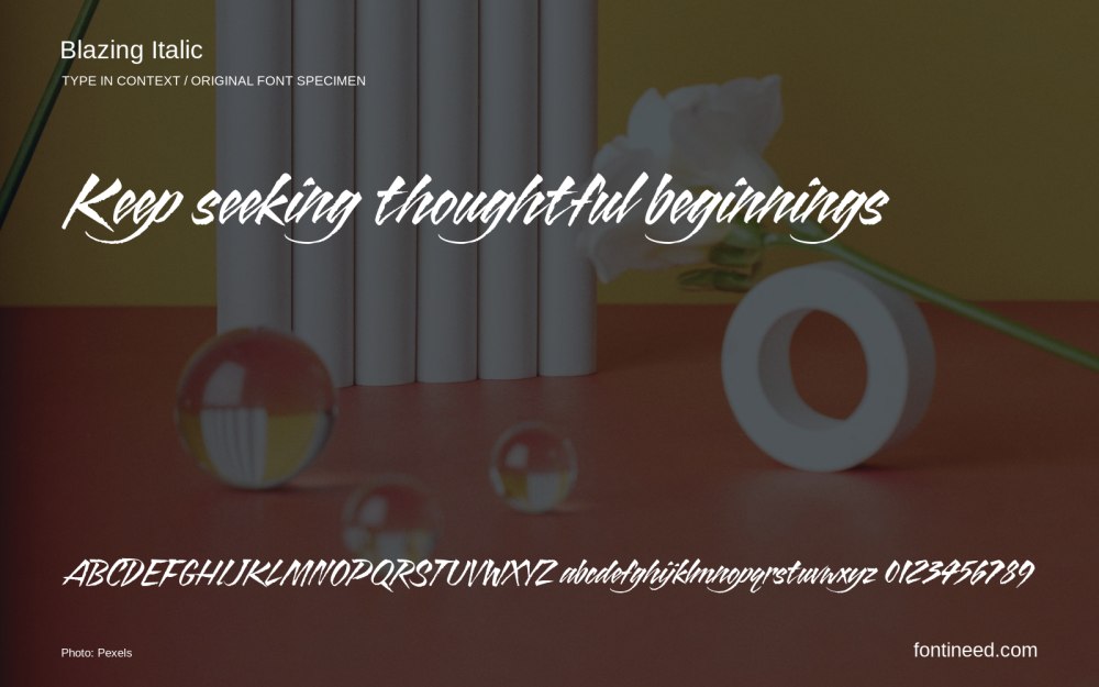
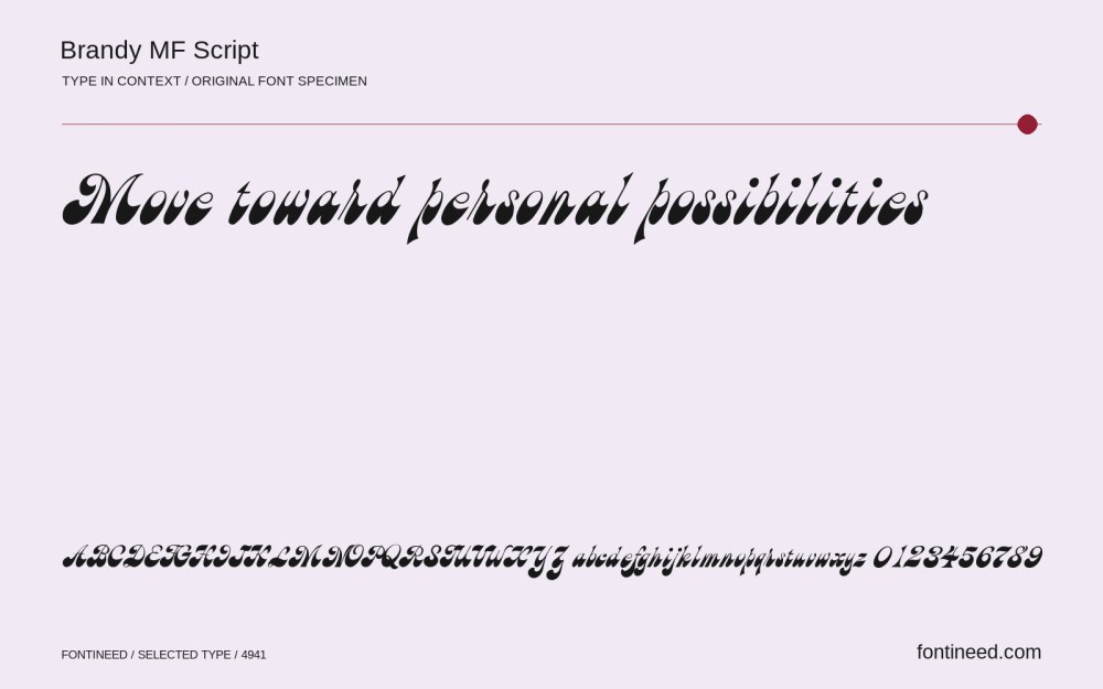
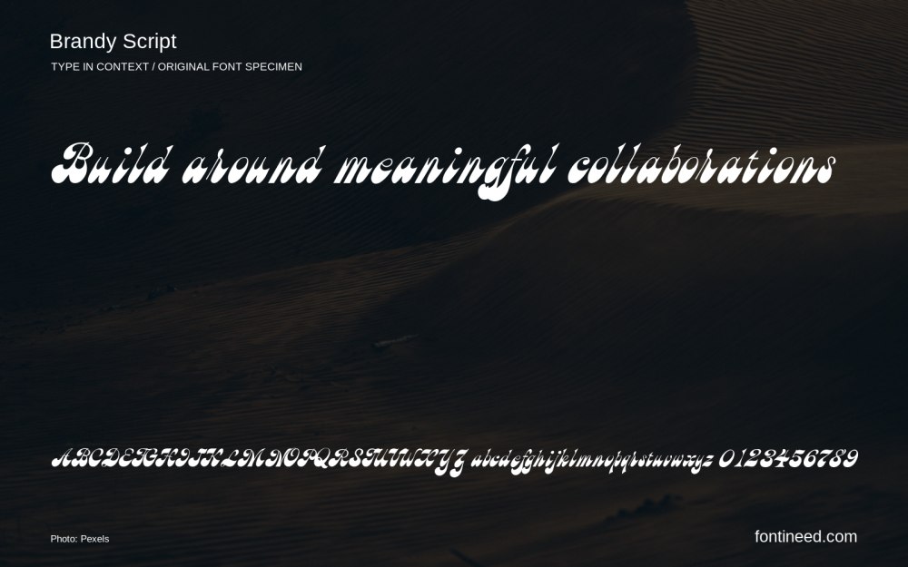
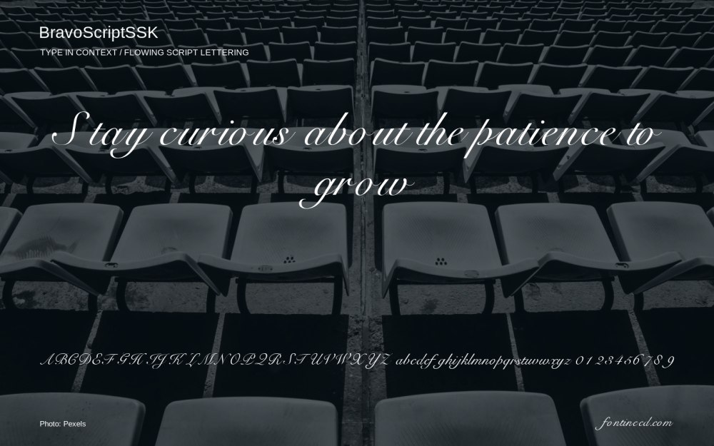
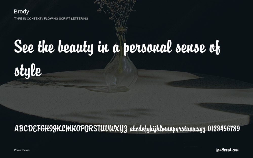
From carefully formed letters to sweeping, expressive capitals. Explore calligraphic styles, compare their contrast and rhythm, and see how they handle the words that matter to you.
Type once to compare the fonts below.
Start with a name, a note or your next big idea.
160 fontsShowing 25–48
Check each font’s license before use.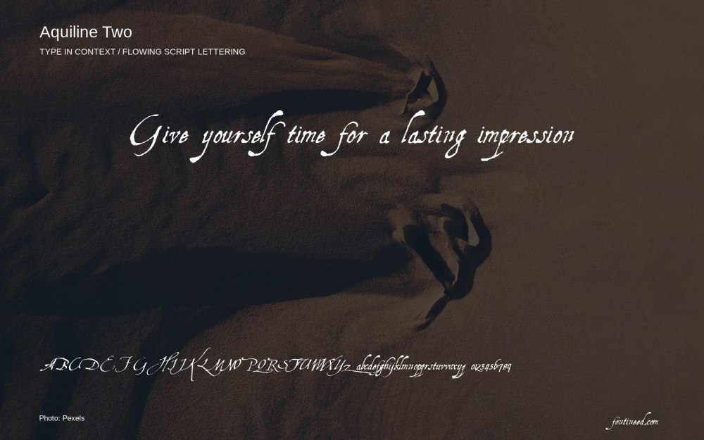
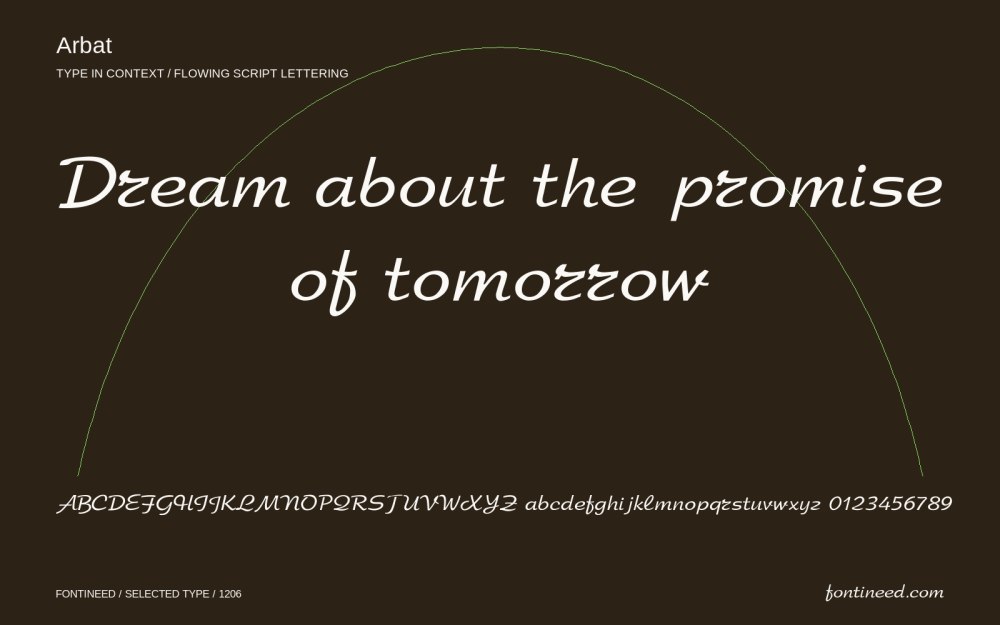
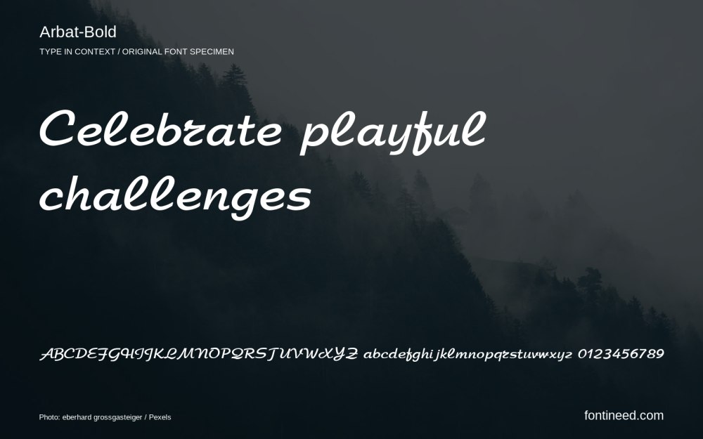
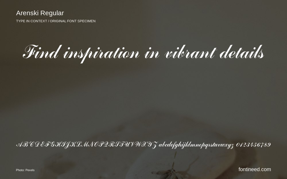


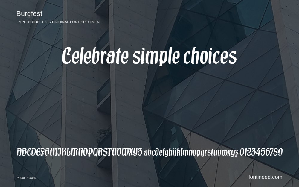
Start with a style. Find your own direction.
Flowing, connected letterforms.
260 fontsFormalPolished lettering for considered occasions.
128 fontsBrushExpressive strokes with visible texture.
47 fontsHandwrittenA loose, personal handwritten rhythm.
364 fonts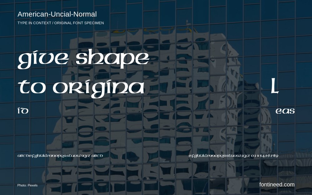 1 matching font
5 fonts · 293 recorded downloads
1 matching font5 fonts · 355 recorded downloads
1 matching font5 fonts · 201 recorded downloads
Calligraphic lettering draws on the movement, angle and pressure of a writing tool. Look closely at capitals, lowercase, punctuation and the joins between letters. Preview your exact wording: a decorative initial and a longer phrase can need very different spacing. Download availability and usage rights vary; read the license on each font’s page before using it.
Looking for a mood, a medium or a project? Explore font categories or discover curated collections.