Wicked
Creator: AyaanFarabi
Wicked in use
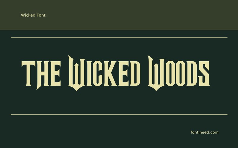
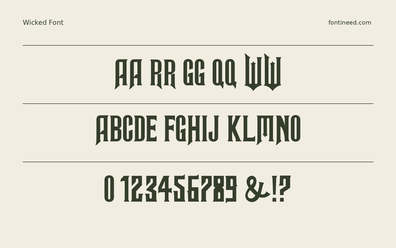
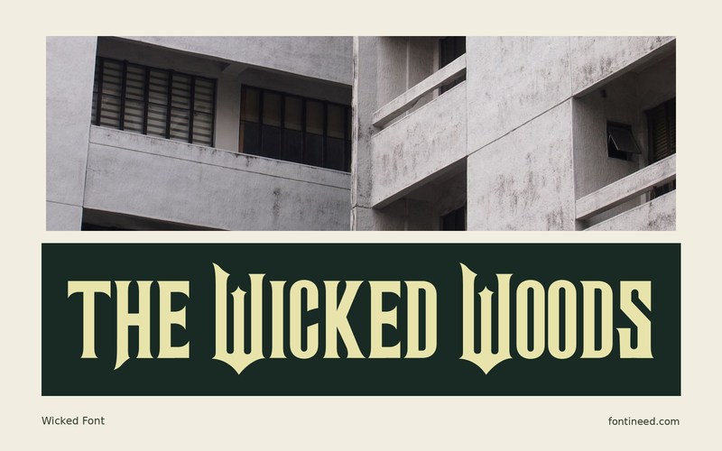
Wicked belongs at a scale where a reader can notice the pointed contrasts and deliberate movement in the forms. “THE WICKED WOODS” is long enough to see how the name leads into the rougher-looking shapes. I’d use it for the title of a fantasy event or a small fictional book cover. The date or author line benefits from a strong difference in voice. Keep that information plain so the display drawing can establish the setting in just a few words.
Try the title beside a short printed description of the setting. The move from an expressive line to a direct sentence should feel like a natural change of reading speed. For a book cover, I’d inspect the spine as well as the thumbnail. A smaller fragment that stays readable can carry the same atmosphere where the full words need more height.

Download Wicked
ZIP archive
Similar Fonts
Related catalog styles; compare the characters and license before choosing.
Newly Added Fonts
Recently added to the FontIneed catalog.


