Arsenica
Creator: Zetafonts
Arsenica in use
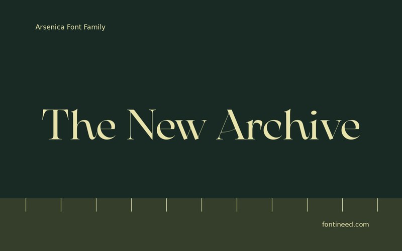
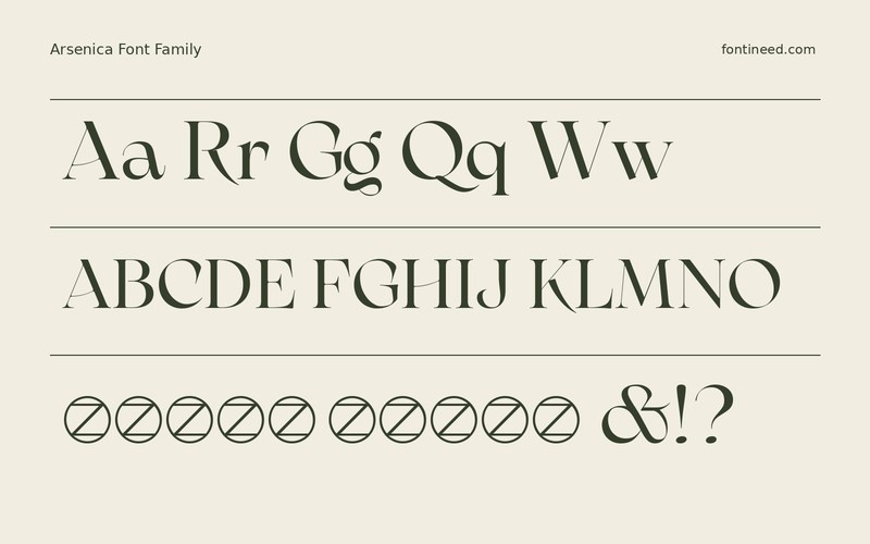
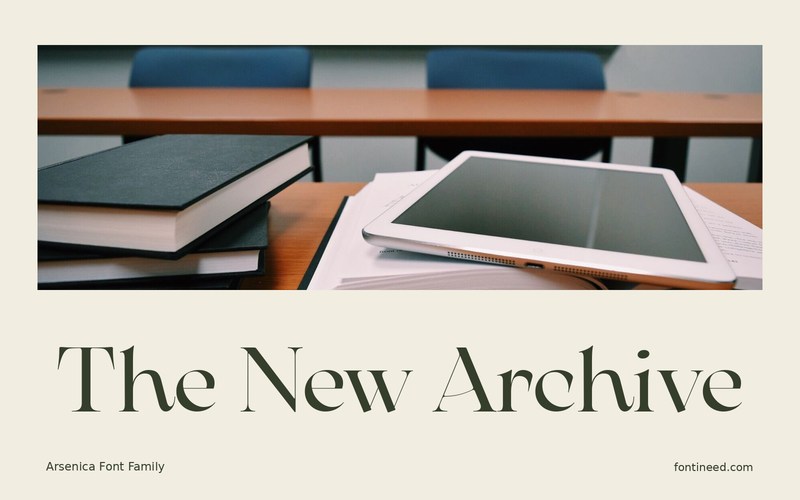
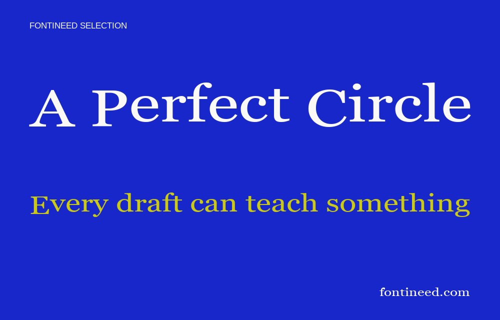
Arsenica suits a fashion or editorial title where the serif shapes are expected to carry a little of the mood. I’d start “The New Archive” in a clean layout and compare how it interacts with both one portrait and a shaded piece of material. Keep the headline near a quiet field when the image gets busier. The text below can use a clearer size and contrast. That preserves the finer edge of the larger letters as part of the personality of the spread.
The detail in the serif belongs on the part of the page someone can see closely. Set the smallest version with the actual image crop to decide where contrast needs to increase. A bound spread makes the gutter a natural limit for the fine drawing. Put the visible part of the title farther from the fold if the last detail needs more contrast.

Download unavailable
This catalog entry is available for reference. A downloadable font file is not currently offered by this page.
Browse fonts with downloadsSimilar Fonts
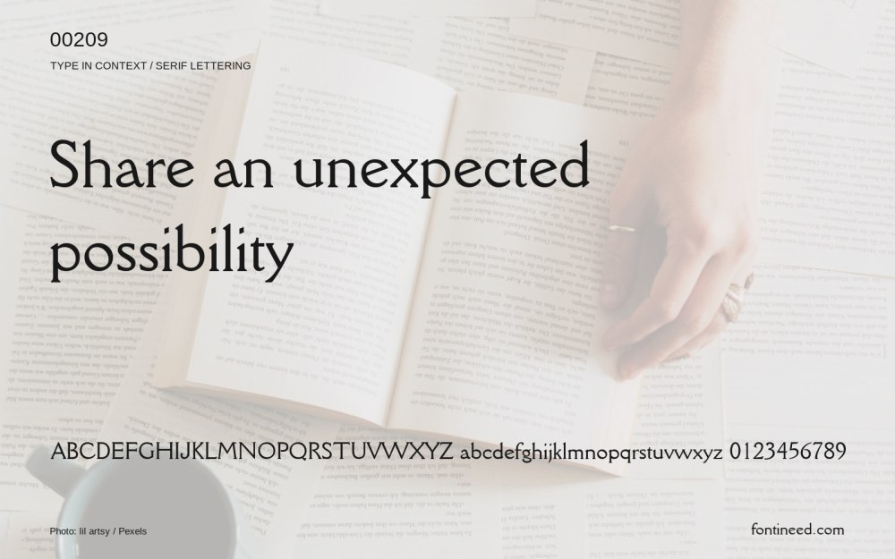
Related catalog styles; compare the characters and license before choosing.


More by Zetafonts
Explore other catalog entries credited to this designer.
Newly Added Fonts
Recently added to the FontIneed catalog.


