Weekly
Creator: Los Andes
Weekly in use
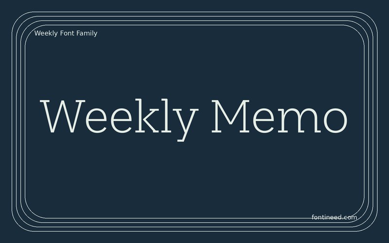
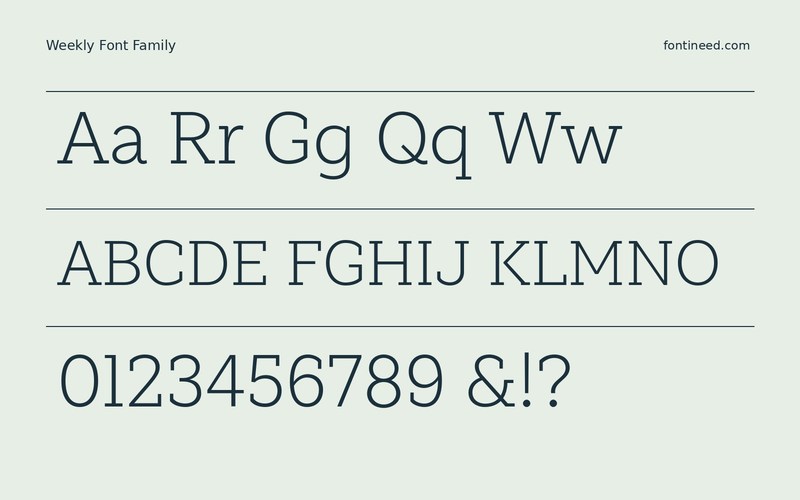
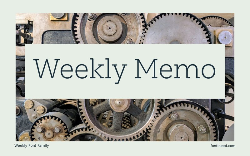
Weekly Light treats slab serifs with a surprisingly light hand. In “Weekly Memo,” the serifs give the line a little more grip without pushing it into the vocabulary of an old poster. I would use it for a recurring column with a clear, relatively open page grid. Put the headline beside a short column of dates and captions to see where the lighter weight holds up. A Semibold cut is also in the package and makes a useful comparison for the smallest headings.
Give long recurring headings the line width that suits the actual issue. The Light cut can lead a page quietly when the surrounding position and contrast do their share of the work. For a cover with a large issue number, give the heading its own narrow or wide area instead of forcing both parts to compete in one line.

Download Weekly
ZIP archive
Similar Fonts
Related catalog styles; compare the characters and license before choosing.



Newly Added Fonts
Recently added to the FontIneed catalog.


