TT Milks
Creator: TYPETYPE
TT Milks in use
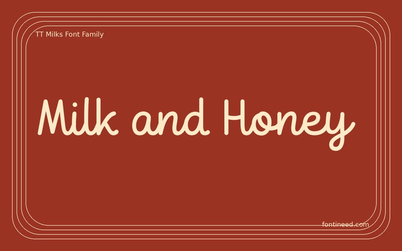
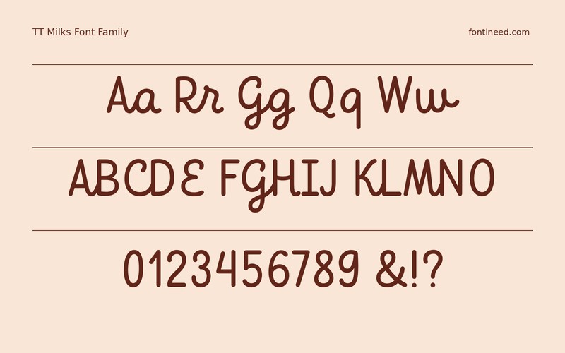
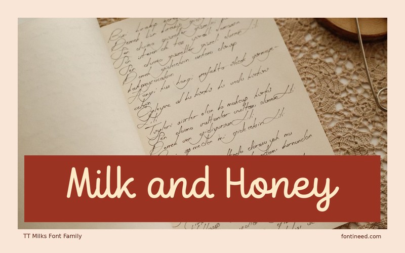
The script cut of TT Milks makes “Milk and Honey” read like a line of hand lettering across a carton rather than a large caption. I’d set the name and a line of ingredients together before deciding where the label wraps. The scripted line needs enough room to finish on the front panel. Pick a companion cut for the smaller writing only after reading it at actual pack size. That’s how the available cuts can share a system without sharing the same voice.
A narrow label may only permit the first word in the most flowing cut. The same mark can still feel coherent if the rest of the line follows a related baseline. The rest of the brand can borrow the same placement and a quieter companion cut. That keeps the script as a recognizable moment on the front without using it everywhere.

Download unavailable
This catalog entry is available for reference. A downloadable font file is not currently offered by this page.
Browse fonts with downloadsSimilar Fonts
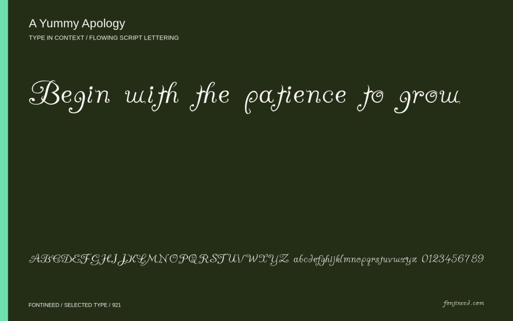
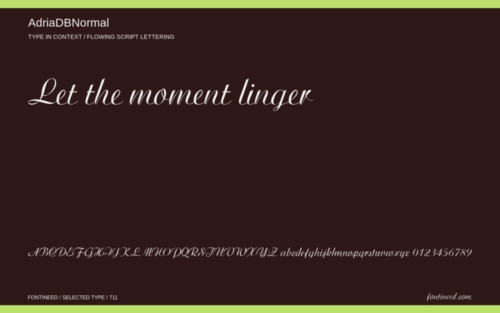
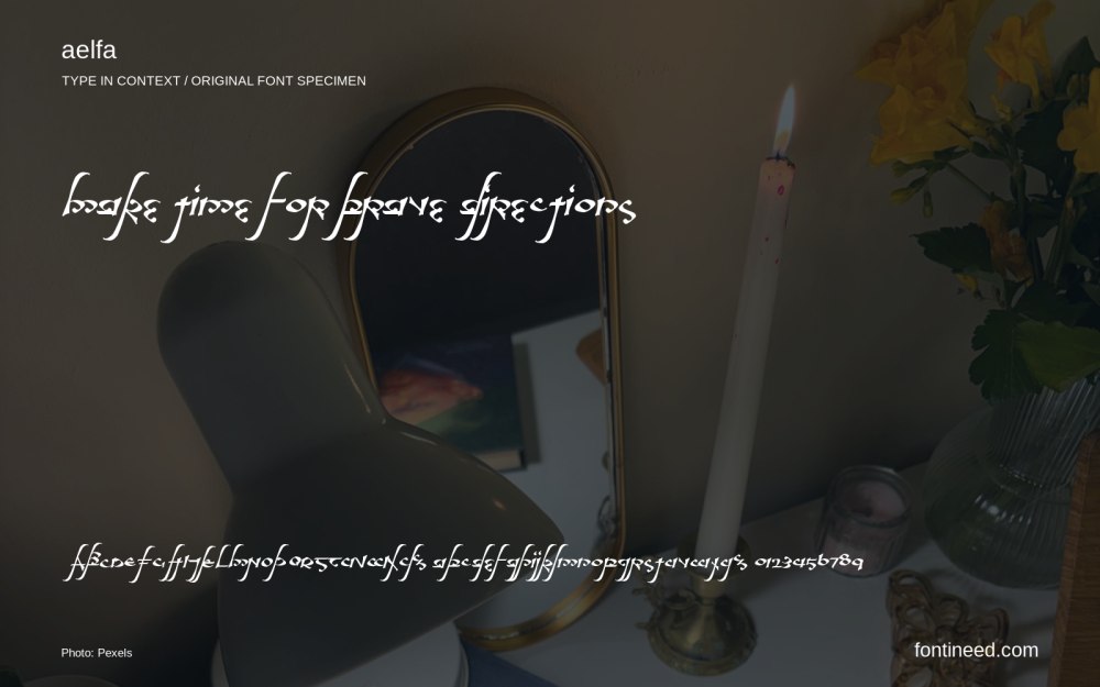
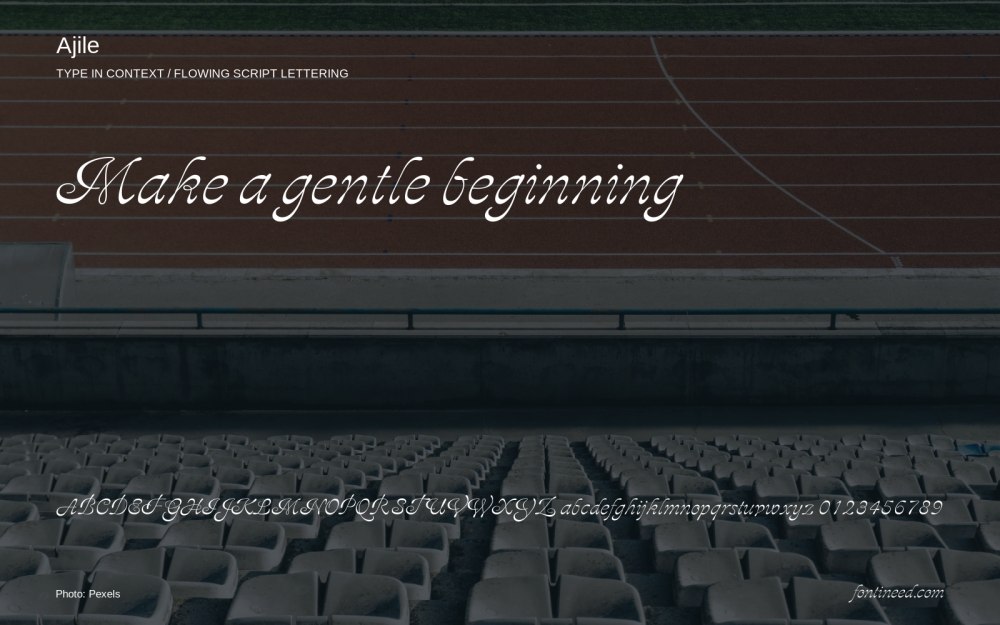
Related catalog styles; compare the characters and license before choosing.
More by TYPETYPE
Explore other catalog entries credited to this designer.

Newly Added Fonts
Recently added to the FontIneed catalog.


