Torken Serif Caps Slant
Creator: defharo
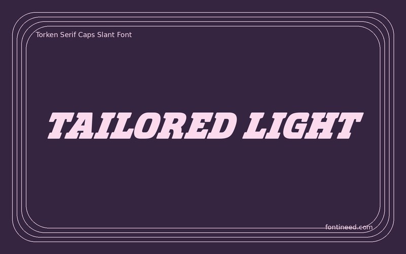
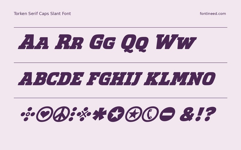
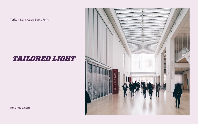
Torken Serif Caps Slant in use
The Caps Slant cut is a specific proposition from Torken. In “TAILORED LIGHT,” the tilt gives large capitals a direction, while the serifs can still establish a formal vocabulary. I’d use that combination on an issue title, with the folio set along a straight margin. On the first print, watch the space on the outlying right edge. Align it by eye against the column instead of measuring the letters as if the line were entirely upright.
With a photograph behind it, only overlap the lettering where the surface is quiet. The slanted edges benefit from one predictable degree of contrast along the whole title. On a narrow cover the slant can lead the eye toward a second line. Think about where that movement should land before placing a subtitle against the right margin.

Download Torken Serif Caps Slant
ZIP archive
Similar Fonts
Related catalog styles; compare the characters and license before choosing.


Newly Added Fonts
Recently added to the FontIneed catalog.


