Stretch Pro Futuristic
Creator: jetsmax
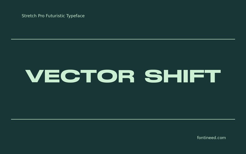
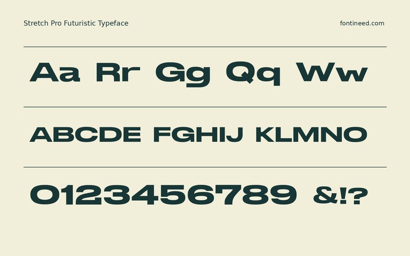
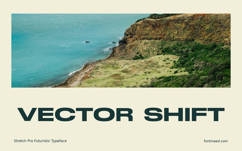
Stretch Pro Futuristic in use
Stretch Pro gives you a reason to build a very wide title. A banner that says “VECTOR SHIFT” can carry that width as part of the visual language instead of working like a normal heading. In a match graphic, I would test it beside the full team names so the main line stays clearly distinct from the moving details below. Its proportions want a strong horizontal margin. The supporting material can make a much smaller footprint without disturbing the title.
Use the widest team name in the thumbnail test. The main mark should have the space to stay recognizably wide even in the crop that gets shared most often. Check that the wordmark still has margin on both sides when its longest version sits in the same grid. That space helps the drawn width remain part of its identity.

Download Stretch Pro Futuristic
ZIP archive
Similar Fonts
Related catalog styles; compare the characters and license before choosing.
Newly Added Fonts
Recently added to the FontIneed catalog.


