Lumierepolis
Creator: GGBotNet
Type Tester
Lumierepolis
Lumierepolis in use
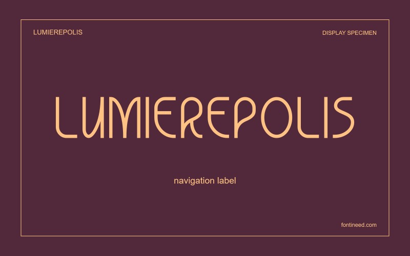
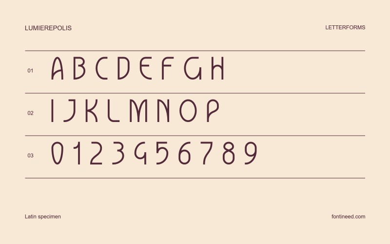
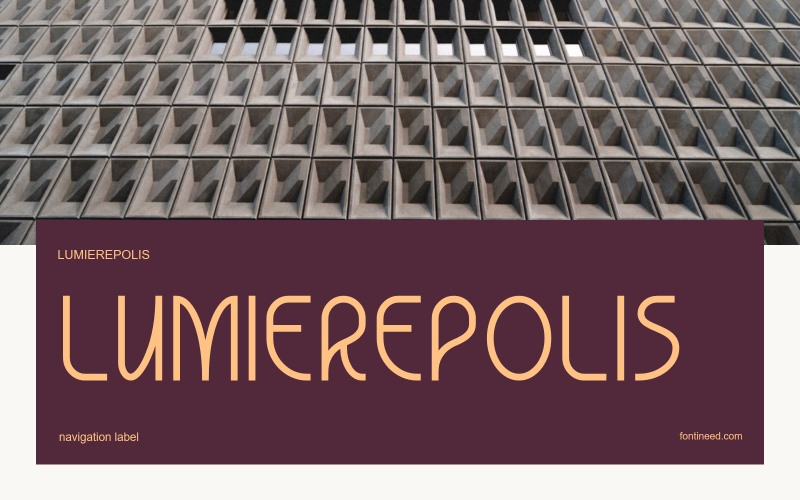
Lumierepolis puts small changes of angle and curvature into a fairly open alphabet. I like the way the individual letters keep something of their own posture in a line of capitals. The effect suits a neighbourhood arts programme or a map with a few expressive landmark labels. I’d set those labels over the actual illustration before choosing a size. The drawing gives them enough informality to belong to the image, especially where the picture already does most of the explaining.

Compare sizes
Character sample
A sample of common input positions. Symbol and legacy-encoded files may show other shapes or missing characters.
Download Lumierepolis
Check license file. An archive readme may contain installation instructions only; check the creator’s usage terms before use.
Similar Fonts
Related catalog styles; compare the characters and license before choosing.
More by GGBotNet
Explore other catalog entries credited to this designer.


Newly Added Fonts
Recently added to the FontIneed catalog.


