Achtung Bravo
Creator: GGBotNet
Type Tester
Achtung Bravo
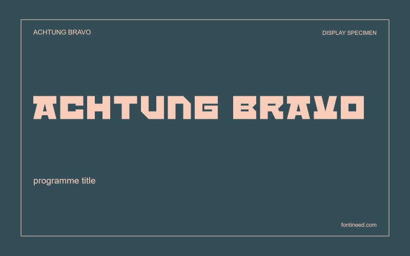
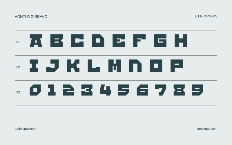
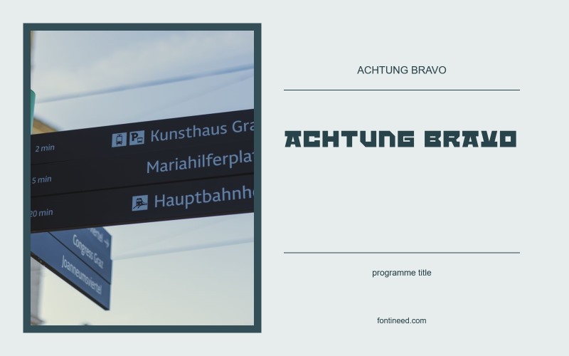
Achtung Bravo in use
Achtung Bravo catches my eye through the contrast between its wide, heavy capitals and the shaped cuts inside them. There’s a swagger to the word even before you add colour. I’d set a brand name with a few round letters and a diagonal in it, such as a label for a loud music release or a piece of motorsport graphics. The counters carry much of the texture. Give them enough size and clean contrast to stay legible from a distance.

Compare sizes
Character sample
A sample of common input positions. Symbol and legacy-encoded files may show other shapes or missing characters.
Download Achtung Bravo
Check license file. An archive readme may contain installation instructions only; check the creator’s usage terms before use.
Similar Fonts
Related catalog styles; compare the characters and license before choosing.
More by GGBotNet
Explore other catalog entries credited to this designer.


Newly Added Fonts
Recently added to the FontIneed catalog.


