Bigplace Roman
Creator: Fernando Haro
A static specimen is not available for this archived character mapping.
Bigplace Roman in use
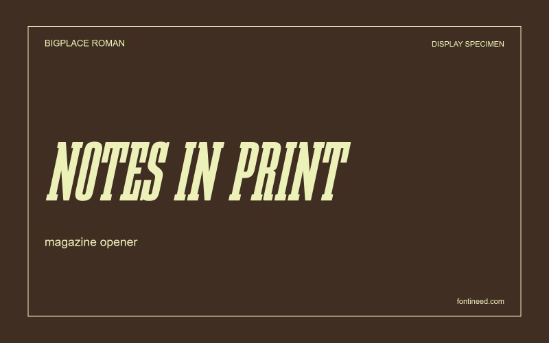
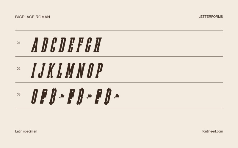
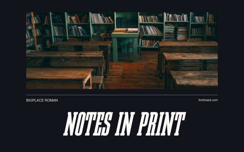
The first impression of Bigplace Roman is speed. Its slanted capitals are narrow enough to pack into a tight headline, and the weight of individual strokes still makes the letters feel physical. I’d give it to a tag line on a racing poster, especially when the main image is already wide and low. Set a long and short line before choosing the scale. Let the long line decide how close the lettering can go to the sides of the frame.

Open Source / OFL
Befonts license listing. The font file specifies different terms.
View on BefontsSimilar Fonts
Related catalog styles; compare the characters and license before choosing.




More by Fernando Haro
Explore other catalog entries credited to this designer.

Newly Added Fonts
Recently added to the FontIneed catalog.


